

Yep, that's what I wanna know, so I avoid problems with colour-deficient people in future maps!
I want to be sure everybody can see the shades.
I'll put thin black lines between those areas, though. The map is far by being finished.
I want to be sure everybody can see the shades.
I'll put thin black lines between those areas, though. The map is far by being finished.


Fine for me (red/green deficient).
Just don't put masses of white between them and it's less of a problem; if we can see the dividing line between the colors (and if colored it's dark red or black or something in that region), we can usually at least tell they're meant to be differentiated, even in the event that the colors look identical to us, but if there's whitespace in-between, all bets are off.
PS: Wait, 3 shades of green? I see two greens and 3 blues…

I are protanomalous: by squinting and being really imaginative, i can see the third shade of green: the boundary runs from like the middle of the large isthmus thing to the south, including the islands at the end of it, ne?
the cream and the blues look totally differentiable to me, but the darker blue <if that's what it is> looks kind of pink to me: fuchsia, purple, you know, one of those colours other people that are not me know the names of. Still, differentiable.
Generally, and i'm no designer or anything, i recommend that your colours not only vary in [good lord i don't know if my terminology is correct here but] hue but also in value: like, you want to put a more yellowy green next to a more bluey green? make the two greens have different amounts of white as well, maybe one is pastel and the other is highly saturated? colour is but one channel of info, and a weird one at that.


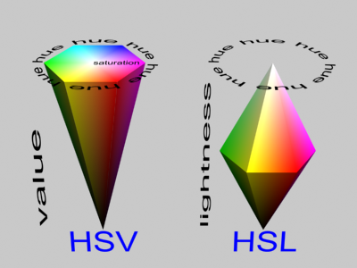
The three attributes of colour that people usually consider when designing something for visual appeal are hue, saturation, and value/luminosity; value is essentially brightness (lighter colours vs. black), saturation is essentially colourfulness (strong colours vs. grey) and hue is the average wavelength of the colour as perceived by the eye (i.e. a rainbow.) Luminosity is this weird in-between thing between value and saturation where the range is extended upwards towards white, and the actual bright colour itself is in the middle. Windows uses an HSL colour picker by default, whereas Photoshop uses HSV.
Due to boring yet fun technical details, however, the human eye doesn't actually work this way; it detects hues as a pair of opposing poles that it contrasts, and grey is simply the occurrence of neutral values in both channels:

(Unimaginatively these poles are called 'a' and 'b', which don't stand for anything. This is called Lab colourspace.)
Computers, of course, use the RGB colourspace for display:

This has interesting consequences because (standard) human eyes are more sensitive to green than red and more sensitive to red than blue. When converting colour images into greyscale, the final value is generally generated with the formula:
v = 0.2989 * r + 0.5870 * g + 0.1140 * b
...which should give you some sense as to the relative brightnesses of the hues in question. There's been a lot of work in recent years on quality of colour selection in data visualization, chiefly as a result of awareness about how this stuff works. For example, if you want to make a heatmap (where different colour schemes correspond to different tiers of activity) you need to make sure your gradient evenly distributes luminosity according to human perception, or the eye will be misled by subtle imbalances in the scale. The most prominent project designed to improve this sort of thing are the Brewer palettes, which are built in the LCH space, a variant of HSL that was built to correct for peculiarities in human perception.
The Brewer palettes also include rainbows that you can use to ensure maximum visibility despite colour vision impairments, and they're honestly pretty attractive, too.
Critically, no two colourspaces are created equal: they each have areas that they emphasize better (e.g. HSV and RGB have more detail for greys than Lab), and none of them are expressive enough to describe everything that a human eye can see, excepting perhaps those with severely deficient monochromatic vision. This, however, is largely because the elements in computer displays do not accurately match the response frequencies in the human eye's receptors:
Eye:

LED:

CRT:

...The key issue, however, is that the human eye determines hue through subtractive combination, a process meant to account for the possibility of mutational drift in the response curve of the actual cone receptors as a result of evolution. This is a computationally and instrumentally difficult process to accommodate, and no one really wants to do the necessary math to make a display that accurately reflects this aspect of human vision, so we use direct linear combinations of the three RGB elements as a "good enough" compromise. Still, there have been promising results in emulating nature by adding elements to display more of the spectrum rather than attempting to make something that is specifically tied into expectations about perception. (Although, from a conworlder's perspective, we're still biased, since the new channel targets the area of the spectrum that is densest for us boring ol' mammals.)
Due to boring yet fun technical details, however, the human eye doesn't actually work this way; it detects hues as a pair of opposing poles that it contrasts, and grey is simply the occurrence of neutral values in both channels:
(Unimaginatively these poles are called 'a' and 'b', which don't stand for anything. This is called Lab colourspace.)
Computers, of course, use the RGB colourspace for display:
This has interesting consequences because (standard) human eyes are more sensitive to green than red and more sensitive to red than blue. When converting colour images into greyscale, the final value is generally generated with the formula:
...which should give you some sense as to the relative brightnesses of the hues in question. There's been a lot of work in recent years on quality of colour selection in data visualization, chiefly as a result of awareness about how this stuff works. For example, if you want to make a heatmap (where different colour schemes correspond to different tiers of activity) you need to make sure your gradient evenly distributes luminosity according to human perception, or the eye will be misled by subtle imbalances in the scale. The most prominent project designed to improve this sort of thing are the Brewer palettes, which are built in the LCH space, a variant of HSL that was built to correct for peculiarities in human perception.
The Brewer palettes also include rainbows that you can use to ensure maximum visibility despite colour vision impairments, and they're honestly pretty attractive, too.
Critically, no two colourspaces are created equal: they each have areas that they emphasize better (e.g. HSV and RGB have more detail for greys than Lab), and none of them are expressive enough to describe everything that a human eye can see, excepting perhaps those with severely deficient monochromatic vision. This, however, is largely because the elements in computer displays do not accurately match the response frequencies in the human eye's receptors:
Eye:
LED:
CRT:
...The key issue, however, is that the human eye determines hue through subtractive combination, a process meant to account for the possibility of mutational drift in the response curve of the actual cone receptors as a result of evolution. This is a computationally and instrumentally difficult process to accommodate, and no one really wants to do the necessary math to make a display that accurately reflects this aspect of human vision, so we use direct linear combinations of the three RGB elements as a "good enough" compromise. Still, there have been promising results in emulating nature by adding elements to display more of the spectrum rather than attempting to make something that is specifically tied into expectations about perception. (Although, from a conworlder's perspective, we're still biased, since the new channel targets the area of the spectrum that is densest for us boring ol' mammals.)


quoting Izambri, Marquis, Princ. of Rebel Croquettes:2. Can you distinguish the five different shades of blue (2) and green (3)?
Protanomalous; yes. You want the light green to be a little lighter, maybe, though.


Source: http://www.slate.com/articles/arts/culturebox/2014/10/if_every_u_s_state_had_the_same_population_what_would_the_map_of_america.html (contains some more designs, some of them are really silly)

Now I'm really curious as to why some of the cities on that map were picked as the "capitals". Many, like Olympia, Des Moines, and Santa Fe, make sense; they're already capitals. But Elyria? Seriously?
You have to find the original version to see the detail. Underlined cities are capitals; neither Cleveland nor Toledo are capitals. (Nor, for that matter, is Chicago.)


I’m sure these have to be useful... somehow...
quoting bloodbath, Lepton, Ohio, USA:Now I'm really curious as to why some of the cities on that map were picked as the "capitals". Many, like Olympia, Des Moines, and Santa Fe, make sense; they're already capitals. But Elyria? Seriously?
A while back I attempted to redraw the US's states by making Voronoi maps around its fifty biggest metro areas. Here was the result:

(Hawai'i is part of San Fransisco; Alaska part of Seattle.)