


Entirely Meaningless.
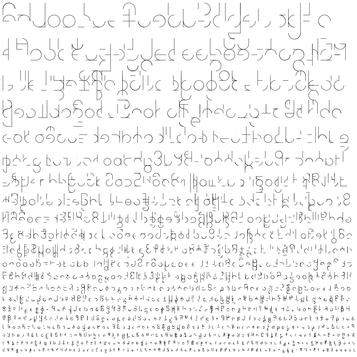


Some cognate pairs in Quomonakian and Pehanaquian, in their native script:
Quomonakian is on the left, Pehanaquian on the right, in two columns. Pehanaquian has a phonetic schwa deriving from *ă, *ɨ̌ and *ĕ that is entirely predictable, however, so it is marked neither in the script nor in the transcription: the cognate of Q. hahpi (in the bottom right-hand corner) is therefore stp (phonetically [əstəp]). A full transcription:
Quomonakian is on the left, Pehanaquian on the right, in two columns. Pehanaquian has a phonetic schwa deriving from *ă, *ɨ̌ and *ĕ that is entirely predictable, however, so it is marked neither in the script nor in the transcription: the cognate of Q. hahpi (in the bottom right-hand corner) is therefore stp (phonetically [əstəp]). A full transcription:
| īh | hēs | xō | nōn |
| mahtēxa | mtān | mičeyā | micīk |
| ese | ht | kʷē | kē |
| ampa | ōlp | šišeyawe | sīsī |
| cospa | tlasp | hahpi | stp |

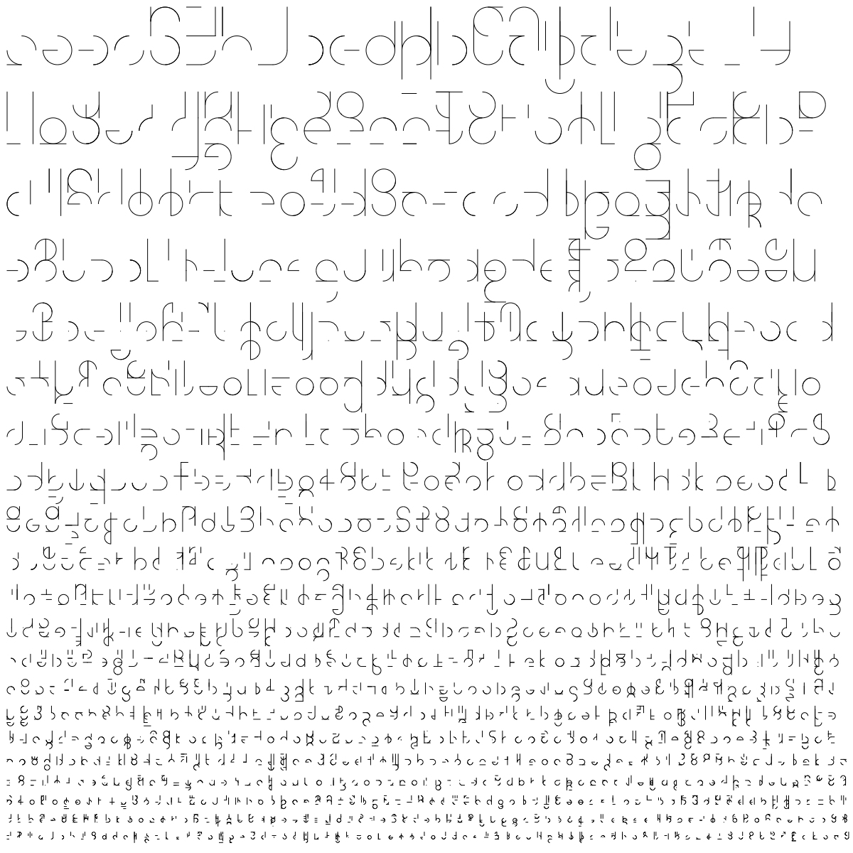
I'm not sure about prettyness, but I love scripts that have letters that flow into each other:

The text says "!ahas dakakela chigils hel tes dadaon", which translates to "the king has not the power to rule, if not given by God".
The text says "!ahas dakakela chigils hel tes dadaon", which translates to "the king has not the power to rule, if not given by God".
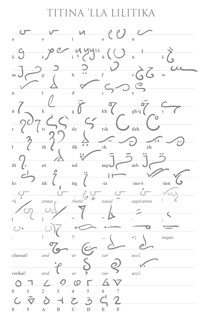
Woah, time out. The minuscule ylf can't have that shape for its second stem. You'd have to use an unevenly-cut quill to draw it1, and it would be completely impossible with a normal fountain pen. To keep the stroke consistent with the rest of the script, the tip needs to be symmetrical, so either both sides of the stroke narrow symmetrically or neither do.
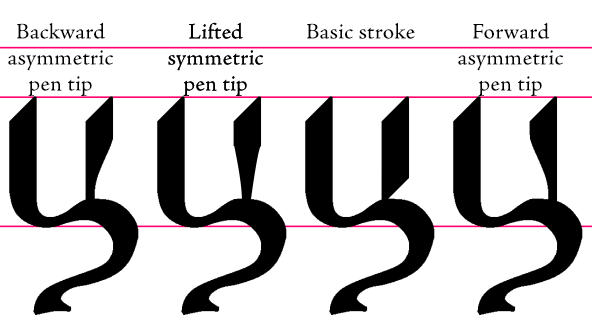
Whenever you see a shape like that, it's either a typographic fantasy or the rest of the script has to look the same way. Font designers regularly work under the assumption that they're designing strokes that would be produced by some pen or other instrument that obeys rules that are impossible for a real pen, but are internally consistent nevertheless. As you've generally been very consistent with the Sunchí script in presenting it as a humanist hand—the other exception being the serif on the minuscule fimfa, which is at least writable with the tip of a flexible pen or quill, although it would be time consuming.
Whenever you see a shape like that, it's either a typographic fantasy or the rest of the script has to look the same way. Font designers regularly work under the assumption that they're designing strokes that would be produced by some pen or other instrument that obeys rules that are impossible for a real pen, but are internally consistent nevertheless. As you've generally been very consistent with the Sunchí script in presenting it as a humanist hand—the other exception being the serif on the minuscule fimfa, which is at least writable with the tip of a flexible pen or quill, although it would be time consuming.
_________________________
1. Such an instrument would not be usable for anything else in the entire script unless it's held backward; even to achieve the stroke drawn requires holding the pen at a very unusual angle. This would be more comfortable for a left-handed writer, but it would still put unusual pressure on the pen tip to draw the top of the stroke, as the left side of the tip would be longer than the right.
1. Such an instrument would not be usable for anything else in the entire script unless it's held backward; even to achieve the stroke drawn requires holding the pen at a very unusual angle. This would be more comfortable for a left-handed writer, but it would still put unusual pressure on the pen tip to draw the top of the stroke, as the left side of the tip would be longer than the right.


Thanks for the feedback.
Bear in mind that sunchí was written with quills or calligraphic brushes (this is mentioned in the article), so the shape of letters doesn't need to follow the strict pattern left by a quill. Being quills and brushes the instruments used the shapes varied from document to document, although not excessively. Regarding the shapes shown in the article, these are to be considered modern typographic versions of the classic style found in old texts.
Regarding fimfa's smaller arm it's perfectly doable with a quill (all the letters were first hand-drawn with a rigid quill, then scanned and, finally, polished with Paint.NET), but there's a trick there: the quill's (or hand's) angle is changed so a straight line is drawn; but you can drawn a curvy line if you want: in that case it'll look wavy, in essence not very different from zanzi's or paf's squiggle.
I could see it being done with a brush more credibly, yeah. I just don't think the left edge of the stroke in ylf can be drawn straightly with a normal quill or pen without a lot of awkwardness or a custom tool. And yes, fimfa's arm is perfectly drawable with the edge of a tool, it's just a stylistic anomaly compared to the rest of the script, as you have a thin line at the same angle as the thickest parts of every other letter.
The script used in this Money Thread post:
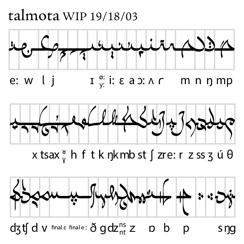
This has a very simple ductus; the oval nib is consistent throughout the script. As is obvious, I was aiming to riff on Semitic abjads, particularly Arabic.
This has a very simple ductus; the oval nib is consistent throughout the script. As is obvious, I was aiming to riff on Semitic abjads, particularly Arabic.
That's an oversight. It's <ú>, which is just /uː/. Within Lilitika's tense-lax system, /uː iː eː/ <ú í é> are paired with /ʌ ɪ ɛ/ <u i e>. Usually the accent of a word has to fall on a tense vowel, with the unpaired /oː/ <o> also counting as tense and the unpaired /a/ <a> counting as lax. Designating where stress falls in a word—especially if it happens to be on a short vowel, as is the case in certain verb forms of the Illeran dialect—got to be such a headache that I developed a Greek "Hellenic" transliteration that still required numerous digraphs even after adding in several Coptic letters.
The three other vowels (/ɒ yː ɔː/ <ô ê û>) are used almost exclusively in interjections and a few modern loanwords, although <ê> does appear in a few roots: <bosêt-> (/boːsyːt/), "luxury," and <vêdt-> (/vyːɾ/ or /vøːɾ/), "precision." It might be a fossilized imitation of a prestigious sociolect.
The three other vowels (/ɒ yː ɔː/ <ô ê û>) are used almost exclusively in interjections and a few modern loanwords, although <ê> does appear in a few roots: <bosêt-> (/boːsyːt/), "luxury," and <vêdt-> (/vyːɾ/ or /vøːɾ/), "precision." It might be a fossilized imitation of a prestigious sociolect.
Fair question. The motivation behind <dt> was partly one of visual aesthetics; the prototypical word (and most frequent cause of use) is the highly productive suffix -idt- (/ɪɾ/), "point," which is responsible for the /ɾ/ in vêdt-. I wanted to do something that wasn't painfully unoriginal with the standard transliteration, which has a pretty obvious bias toward English. The particular form has two bases: <dt> represents an easy English mnemonic for how to pronounce the letter, since the vast majority of native speakers will only use an alveolar tap in the place of a "t", and it's often transcribed as "dd" in such cases, e.g. "wadder" for "water." <dd> and <tt> are both legal in Lilitika, but adjacent consonants with different voicing must be separated by a vowel.
Secondly, perhaps more importantly, /ɾ/ generally behaves like a partly lenited third alveolar plosive in Lilitika, and has few if any situations where it shows a clear relationship with the liquids, /w j l ɹ/ <w y l r>. So, having any hint of <r> in the orthography would confuse this. For similar reasons, when I decided <gh> /ɣ/ would evolve into /ʁ/ in later chronolects (admittedly not much of a difference) I gave it a new grapheme, <q>. (The same era also saw a number of alveolar consonants shift toward palatal forms, which had the unfortunate effect of making the Lilitai sound like they were hearing impaired.)
I've thought a fair bit about input devices, and my conclusion is mixed. On their own, the Lilitai would probably develop pen-based input for written language, but thousands of years of Ksreskézaian innovation and ergonomics is more conducive to a gripped interface, where the letters are typed in tachygraphic/stenotype chords, like a keyer wrapped around a joystick or handlebar.
However, as one of the key themes in the setting is that, despite being set half a million years in the future, human civilization has never experienced a dark age so severe that it lost all access to its history, some relics of the ancient past were never, ever replaced. The scientific language is still formal Modern English, much like Latin was the scientific language of the 19th Century. This is largely a matter of practicality, but it is also a part of a larger trend toward reverence for the dawn of civilization, one practically unique in the cosmos because it was never followed by a sunset. Terraphiles—not all of them descendants of Terrans—partake of media from that era, much as Classics departments today still put on ancient Greek and Roman plays. Most of them are just casually interested in the subject—but some go through a "phase" of terramania, some are just interested because it's the latest craze, and a very small number of individuals turn into TV-obsessed hermits, watching recordings of 24-hour news channels for years at a time, with commercial breaks intact. (At that point, friends usually stage an intervention.)
With this in mind, while the Lilitai may not have traditional keyboards themselves, it is almost certain that after they rejoined humanity, there was someone nearby with a QWERTY keyboard not much different from yours, and someone else who has just realized the first person has a QWERTY keyboard and is now looking extremely smug, because theirs is a Dvorak.