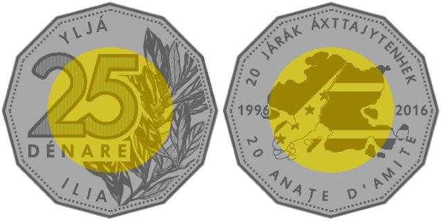
I like money. I also was bored and decided to work on some new-ish stuff. So here's a commemorative coin to celebrate Ilia and Telemor being friends for 20 years (after several decades of very... "special" relationships). Not meant for general circulation, but it still would be exceptionally shiny were it to exist in physical form.
In recent semi-artistic output as a part of my process of continuously revamping and reworking things and stuff:
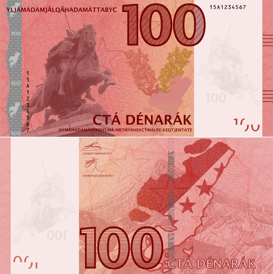
Was bored, so made a new banknote. (First in a while... I really should get back into the swing of making these.)
Approximate value is US$2.00/€1.80/GB£1.60. Introduced to try to fill the gap between the 25 and 100-dénar notes (especially to pull some pressure off of the 25's) and in commemoration of 20 years of friendship between Telèmor and Ilia.
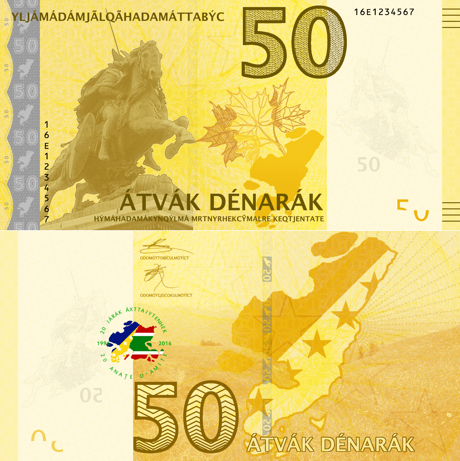
Approximate value is US$2.00/€1.80/GB£1.60. Introduced to try to fill the gap between the 25 and 100-dénar notes (especially to pull some pressure off of the 25's) and in commemoration of 20 years of friendship between Telèmor and Ilia.
Making banknotes may be a logical next step for some of you who are thinking about your conworld, especially a more modern conworld or one perhaps set from the 19th century onwards. And, apparently since I can make somewhat passable notes, I thought I could do a tutorial of sorts.
The issue is that, when I design notes, I work perhaps in a bit of a haphazard way: I don’t always work linearly. So I’ll try to make this a bit more linear and, rather than a how-to guide that’s a “you must do it like this”, more of showing what your options are and how to do what. First, I’ll start by marking out some of the prepwork you should do before getting started with making the notes, then how I go about design followed up by common features of notes that are sometimes good to do.
This tutorial is also perhaps more relevant for more modern notes. Older-style notes, like the pre-1950’s British notes, are not my main interest, but some of the techniques and features here might be of use.
First of all, if you’re doing this on the computer, you need a graphics program, preferably one able to work in layers. (Granted, when I was a teenager, I used colored pencils and paper, but that’s less easy to work with in some respects.) Being able to make layers will make your life a LOT easier, especially since it’s easier to edit just one layer rather than having to go through the whole design. This means I emphatically advise against using MSPaint.
Photoshop and/or Adobe Illustrator probably are the best programs, but they are (a) expensive and (b) from my limited experience with them, a bit unwieldy for first-time users.
The program I use is called paint.NET; it’s a raster graphics program that works a lot like MSPaint, but with layers and a lot of customizability (lots of plug-ins and extra features). Inkscape is a free vector graphics program that also can do the job, and it’s a bit easier to edit some things and rescale designs to larger sizes, but I find Inkscape to also be a bit odd to work with in some respects. Ultimately, you should choose whatever makes you comfortable and you feel comfortable working in.
Once you’ve identified your program, the next step requires a bit of planning: you should have in mind the issuing authority of the banknotes (often a central bank or treasury, but not always; see Macao, Hong Kong, and Scotland), the name of the currency, and the denominations. A lot of notes also indicate some sort of promise to pay statement, so preparing a lot of the texts, especially if in a conlang, can be beneficial.
The denomination structure is also important. A rule of thumb I’ve heard is that an efficient currency structure has its lowest banknote denomination at no less than around 5% of the average daily wage of a worker (and the highest coin at 2% of the average daily wage). Also, think about how much people will be using cash and what typical amounts are: banknotes are generally less durable than coins, so they’ll need replacement faster if they make up lower denominations (like in India, the US, Serbia, and Romania). If you’re working on an Asian-inspired country, keep in mind that most denominations start with 1 and 5 (ex. 10, 50, 100, 500…); in European and European-inspired countries, more use of 2- and 25-based denominations is made.
Color is also a good thing to think about. While some countries use the same color for all the banknotes (ex. the US, before around 2004), this isn’t particularly effective. I’ve found the best systems are where the colors are bold and contrasting between denominations: for example, the euro banknotes were designed to alternate between “warm” and “cool” colors; a similar principle can be found in the most recent series of South Korean notes. Whatever you choose, having strongly contrasting colors between adjacent denominations is a good thing, especially if your notes are all the same size.
Speaking of sizes, practically all notes are rectangular. In older times, notes were very large in both length and width; nowadays, though, they’re considerably more compact, with aspect ratios of length to width ranging from 1.6 to 2.25 to 1. It seems like around either 1.7 or 2 are very popular. Where banknote sizes differ between denominations, each country takes a slightly different approach: some preserve the aspect ratio, while others may increase both dimensions by a fixed amount and others still just change one dimension (length, usually). It’s quite unusual for normally-used notes, at least in common use nowadays, to exceed 8 cm in width.
So, once you’ve settled on colors, sizes, and denominations…
In most cases, banknotes say something about the country they represent whether it be its history, its people, its culture, or something else. The use of famous or otherwise important people is quite common; if a monarch rules your country, he/she would be a fairly logical choice, at least for the front. Monuments and landmarks are very common for reverse sides, as are landscapes, flowers, and sometimes handicrafts and paintings.
Motifs should be fairly distinct for each note; if a person is featured, tying the motif into that person helps create a unified concept. For example, on the old German mark notes, the fronts would feature a famous artist, writer, or scientist and the reverse would feature a motif related to their work (ex. the 100-mark note, with pianist Clara Schumann on the front, had a piano on the reverse).
Ever since Australia introduced their first polymer note in the late 80's, polymer banknotes have become increasingly popular, with seven countries having completely switched their notes to polymer (Australia, New Zealand, Romania, Vietnam, Papua New Guinea, Brunei, and Canada) and several others having converted some part of their note structure to plastic, in particular a lot of the smaller denominations (ex. Singapore, Mexico, and Malaysia, with the smaller denominations in polymer). Polymer notes are more expensive to manufacture, but they tend to last longer and are a bit more durable; additionally, they're quite a bit harder to counterfeit, but the security features that can be incorporated into polymer notes are different compared to those that paper notes can have.
In mentioning the security features, I'll mention the ones that go well with only polymer notes versus the ones that only paper notes can have.
Making security features is important with any banknote. Granted, a lot of times, in the actual design prototypes, the features/elements aren't defined and are provided at a later stage; however, since it is unlikely that my banknotes will ever be printed (however much I may want them to be), I like to incorporate elements into the designs I make.
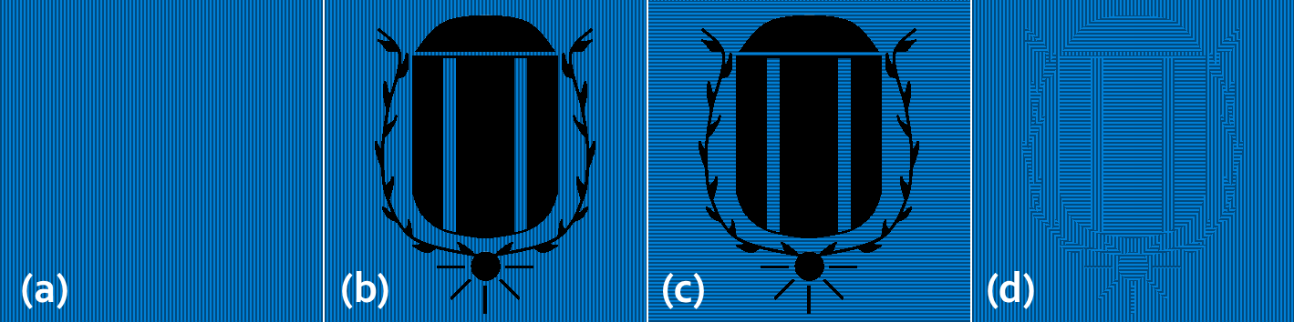
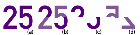
Latent Text/Image: This is a kind of feature where there is writing or some other feature that isn't obvious when looking directly at the note, but becomes more visible when you look at the note from an angle. This appears in a lot of other applications such as visas, passports, and the like, so this technique is for more than just money.
How to make it: For latent images, I normally use four steps.
(a) Lay down the first layer, which should be the base pattern. I normally use continuous stripes in one direction: they should be fairly close together without being too sparse. (For those using Paint.NET, I normally use either the "narrow stripes" or the "dark stripes" feature.)
(b) On top of the first layer, write/draw/paint (in solid colored) what you want to have as the latent image. Oftentimes, it's a phrase or number; it can also be an image. (I'll call this layer B.)
(c) Beneath this top layer, lay a second layer with the stripes running in a different direction (I'll call this layer C).
(d) Erase the bits of layer C that aren't covered by layer B, then delete layer B. This should give you a nice, contrasting image. (See below for an example of this at work.)
Perfect registration device: Two halves of an image that, when the banknote is held up to the light, come together to form a single, coherent image.
How to make it: This is a fairly easy thing to do: take an object and divide it into half (making sure they line up!). One half will go on the back while the other goes on front.
Microprint: Super-tiny text, normally in places where you wouldn’t expect text to be. Often incorporated into designs as lines so that, when viewed with the naked eye, it appears as a line, but, when seen up close, it’s actually text. Use as small a font as possible while having it still be readable; depending on the program, you can have the text also follow a path.
Guilloché/Spirograph: Intricate, woven designs with many loops and iterations. Often used in security printing; any changes in the background are easily detected.
How to make it: I actually use an online applet to design guilloché patterns. Make sure to set the background to either black or white, depending on how you’ll be using the patten; from there, with a white background, I normally set the layer containing the pattern to a multiplying or darkening layer and go with that.
Moiré/Bent Moiré Pattern: A Moiré pattern consists of two otherwise identical layers of repeating parallel vertical lines, one of which being tilted at a small angle (anywhere from 2-20º, in my experience, gives the best results). If your program permits such, you can then angle the upper layer to create more of a circular or bowed pattern. Great for backgrounds and underprint.
How to make:
Omron Rings/EURion Constellation: An anti-copying device consisting of five rings in a specific pattern. Also covered in detail on the magical Wikipedia.
(I call these "on top of the design" because these are normally incorporated into your upper layers in a layer-based graphics program, on top of other elements.)
Hologram/Holograph: A shiny, reflective device with an image that changes based on viewing angle. First appearing on the Austrian 5000-Schilling note in the late 80's, the presence of holographs has been diminishing, but it's a ubiquitous feature on many currencies' notes. Can take the form of patches, stripes, and sometimes interesting shapes. Does not often appear on polymer notes (though this has been changing as of late: see the Canadian dollar notes from 2011 onwards.
(to be continued)
Color-changing ink/OVI: As the name implies. If you tilt the note one way, the ink looks one color; tilt the note another way and it looks a different, often complementary color. Very common on most notes: Euro notes of €50 and up all have a pink-to-green OVI on the reverse, and US notes of $5 and up also all have an OVI on the front.
How to make it: To symbolize an OVI device, I normally have a large block of color with some noise. Since the extra colors aren't visible except at an angle, there is no need to incorporate the second color (except when, for example, showing the note at an angle in a poster).
Iridescent/Mother-of-Pearl Ink: An ink that’s exceptionally shiny; not normally visible except by tilting the banknote. Normally appear in blues, yellows, pinks, and sometimes greens.
Security thread (generally paper notes only): A woven metal thread that runs through the banknote; normally visible under transmitted light. These can be windowed, which means that they appear as regularly-distributed broken bits through the paper, or as a single dark stripe.
(to be continued)
The issue is that, when I design notes, I work perhaps in a bit of a haphazard way: I don’t always work linearly. So I’ll try to make this a bit more linear and, rather than a how-to guide that’s a “you must do it like this”, more of showing what your options are and how to do what. First, I’ll start by marking out some of the prepwork you should do before getting started with making the notes, then how I go about design followed up by common features of notes that are sometimes good to do.
This tutorial is also perhaps more relevant for more modern notes. Older-style notes, like the pre-1950’s British notes, are not my main interest, but some of the techniques and features here might be of use.
Preliminary Work
First of all, if you’re doing this on the computer, you need a graphics program, preferably one able to work in layers. (Granted, when I was a teenager, I used colored pencils and paper, but that’s less easy to work with in some respects.) Being able to make layers will make your life a LOT easier, especially since it’s easier to edit just one layer rather than having to go through the whole design. This means I emphatically advise against using MSPaint.
Photoshop and/or Adobe Illustrator probably are the best programs, but they are (a) expensive and (b) from my limited experience with them, a bit unwieldy for first-time users.
The program I use is called paint.NET; it’s a raster graphics program that works a lot like MSPaint, but with layers and a lot of customizability (lots of plug-ins and extra features). Inkscape is a free vector graphics program that also can do the job, and it’s a bit easier to edit some things and rescale designs to larger sizes, but I find Inkscape to also be a bit odd to work with in some respects. Ultimately, you should choose whatever makes you comfortable and you feel comfortable working in.
Once you’ve identified your program, the next step requires a bit of planning: you should have in mind the issuing authority of the banknotes (often a central bank or treasury, but not always; see Macao, Hong Kong, and Scotland), the name of the currency, and the denominations. A lot of notes also indicate some sort of promise to pay statement, so preparing a lot of the texts, especially if in a conlang, can be beneficial.
The denomination structure is also important. A rule of thumb I’ve heard is that an efficient currency structure has its lowest banknote denomination at no less than around 5% of the average daily wage of a worker (and the highest coin at 2% of the average daily wage). Also, think about how much people will be using cash and what typical amounts are: banknotes are generally less durable than coins, so they’ll need replacement faster if they make up lower denominations (like in India, the US, Serbia, and Romania). If you’re working on an Asian-inspired country, keep in mind that most denominations start with 1 and 5 (ex. 10, 50, 100, 500…); in European and European-inspired countries, more use of 2- and 25-based denominations is made.
Color is also a good thing to think about. While some countries use the same color for all the banknotes (ex. the US, before around 2004), this isn’t particularly effective. I’ve found the best systems are where the colors are bold and contrasting between denominations: for example, the euro banknotes were designed to alternate between “warm” and “cool” colors; a similar principle can be found in the most recent series of South Korean notes. Whatever you choose, having strongly contrasting colors between adjacent denominations is a good thing, especially if your notes are all the same size.
Speaking of sizes, practically all notes are rectangular. In older times, notes were very large in both length and width; nowadays, though, they’re considerably more compact, with aspect ratios of length to width ranging from 1.6 to 2.25 to 1. It seems like around either 1.7 or 2 are very popular. Where banknote sizes differ between denominations, each country takes a slightly different approach: some preserve the aspect ratio, while others may increase both dimensions by a fixed amount and others still just change one dimension (length, usually). It’s quite unusual for normally-used notes, at least in common use nowadays, to exceed 8 cm in width.
So, once you’ve settled on colors, sizes, and denominations…
Motifs
In most cases, banknotes say something about the country they represent whether it be its history, its people, its culture, or something else. The use of famous or otherwise important people is quite common; if a monarch rules your country, he/she would be a fairly logical choice, at least for the front. Monuments and landmarks are very common for reverse sides, as are landscapes, flowers, and sometimes handicrafts and paintings.
Motifs should be fairly distinct for each note; if a person is featured, tying the motif into that person helps create a unified concept. For example, on the old German mark notes, the fronts would feature a famous artist, writer, or scientist and the reverse would feature a motif related to their work (ex. the 100-mark note, with pianist Clara Schumann on the front, had a piano on the reverse).
Paper or Plastic?
Ever since Australia introduced their first polymer note in the late 80's, polymer banknotes have become increasingly popular, with seven countries having completely switched their notes to polymer (Australia, New Zealand, Romania, Vietnam, Papua New Guinea, Brunei, and Canada) and several others having converted some part of their note structure to plastic, in particular a lot of the smaller denominations (ex. Singapore, Mexico, and Malaysia, with the smaller denominations in polymer). Polymer notes are more expensive to manufacture, but they tend to last longer and are a bit more durable; additionally, they're quite a bit harder to counterfeit, but the security features that can be incorporated into polymer notes are different compared to those that paper notes can have.
In mentioning the security features, I'll mention the ones that go well with only polymer notes versus the ones that only paper notes can have.
Security Features
Making security features is important with any banknote. Granted, a lot of times, in the actual design prototypes, the features/elements aren't defined and are provided at a later stage; however, since it is unlikely that my banknotes will ever be printed (however much I may want them to be), I like to incorporate elements into the designs I make.
Within the design
Latent Text/Image: This is a kind of feature where there is writing or some other feature that isn't obvious when looking directly at the note, but becomes more visible when you look at the note from an angle. This appears in a lot of other applications such as visas, passports, and the like, so this technique is for more than just money.
How to make it: For latent images, I normally use four steps.
(a) Lay down the first layer, which should be the base pattern. I normally use continuous stripes in one direction: they should be fairly close together without being too sparse. (For those using Paint.NET, I normally use either the "narrow stripes" or the "dark stripes" feature.)
(b) On top of the first layer, write/draw/paint (in solid colored) what you want to have as the latent image. Oftentimes, it's a phrase or number; it can also be an image. (I'll call this layer B.)
(c) Beneath this top layer, lay a second layer with the stripes running in a different direction (I'll call this layer C).
(d) Erase the bits of layer C that aren't covered by layer B, then delete layer B. This should give you a nice, contrasting image. (See below for an example of this at work.)
Perfect registration device: Two halves of an image that, when the banknote is held up to the light, come together to form a single, coherent image.
How to make it: This is a fairly easy thing to do: take an object and divide it into half (making sure they line up!). One half will go on the back while the other goes on front.
Microprint: Super-tiny text, normally in places where you wouldn’t expect text to be. Often incorporated into designs as lines so that, when viewed with the naked eye, it appears as a line, but, when seen up close, it’s actually text. Use as small a font as possible while having it still be readable; depending on the program, you can have the text also follow a path.
Guilloché/Spirograph: Intricate, woven designs with many loops and iterations. Often used in security printing; any changes in the background are easily detected.
How to make it: I actually use an online applet to design guilloché patterns. Make sure to set the background to either black or white, depending on how you’ll be using the patten; from there, with a white background, I normally set the layer containing the pattern to a multiplying or darkening layer and go with that.
Moiré/Bent Moiré Pattern: A Moiré pattern consists of two otherwise identical layers of repeating parallel vertical lines, one of which being tilted at a small angle (anywhere from 2-20º, in my experience, gives the best results). If your program permits such, you can then angle the upper layer to create more of a circular or bowed pattern. Great for backgrounds and underprint.
How to make:
Omron Rings/EURion Constellation: An anti-copying device consisting of five rings in a specific pattern. Also covered in detail on the magical Wikipedia.
On top of the design
(I call these "on top of the design" because these are normally incorporated into your upper layers in a layer-based graphics program, on top of other elements.)
Hologram/Holograph: A shiny, reflective device with an image that changes based on viewing angle. First appearing on the Austrian 5000-Schilling note in the late 80's, the presence of holographs has been diminishing, but it's a ubiquitous feature on many currencies' notes. Can take the form of patches, stripes, and sometimes interesting shapes. Does not often appear on polymer notes (though this has been changing as of late: see the Canadian dollar notes from 2011 onwards.
(to be continued)
Color-changing ink/OVI: As the name implies. If you tilt the note one way, the ink looks one color; tilt the note another way and it looks a different, often complementary color. Very common on most notes: Euro notes of €50 and up all have a pink-to-green OVI on the reverse, and US notes of $5 and up also all have an OVI on the front.
How to make it: To symbolize an OVI device, I normally have a large block of color with some noise. Since the extra colors aren't visible except at an angle, there is no need to incorporate the second color (except when, for example, showing the note at an angle in a poster).
Iridescent/Mother-of-Pearl Ink: An ink that’s exceptionally shiny; not normally visible except by tilting the banknote. Normally appear in blues, yellows, pinks, and sometimes greens.
Security thread (generally paper notes only): A woven metal thread that runs through the banknote; normally visible under transmitted light. These can be windowed, which means that they appear as regularly-distributed broken bits through the paper, or as a single dark stripe.
Putting Everything into Place
(to be continued)
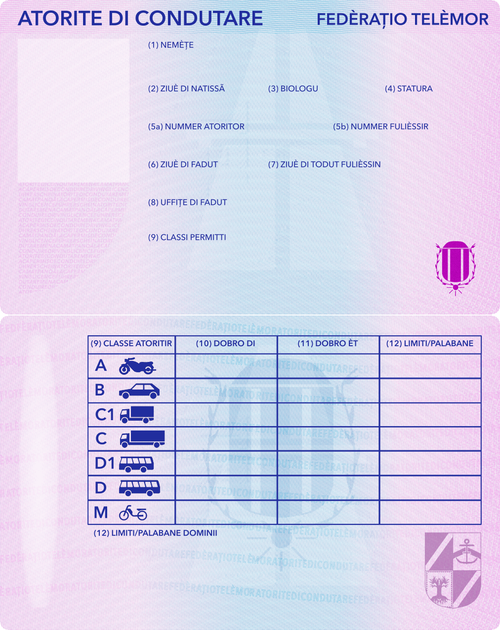
After getting my Luxembourgish driver's license, I got inspired to redo the Telemor license. And I tried it in a new-ish program compared to what I normally use (Inkscape rather than Paint.NET).
I can say that using Inkscape worked here, though it definitely takes a LOT to get everything where you want it to be. Because it's a vector program, it's a lot easier to modify things once they're put in place (which is great for, for example, editing text); at the same time, though, it being a vector program makes it way too easy to screw things up because of the layers and how things are placed on layers. And, even with that, I still did a final touch-up in Paint.NET, but at least the major work was done with Inkscape. And I'm happy with how it turned out.
And, also because reasons, I also made a Telemor learner permit/provisional license. It's meant to be issued as a piece of paper rather than as a plastic card, so it's only one-sided.
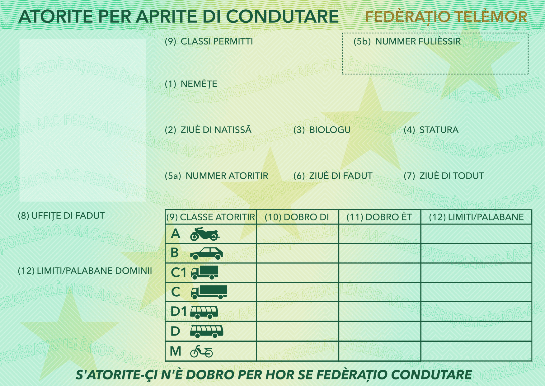
Unsurprisingly, I don't like really leaving things as they are, which is both good and bad: good because it means I'm constantly working at improving things and making them better, but not as good in that I keep seeing faults. That said, though, one of the recent things I redesigned are some passport stamps for some of my concountries.
I've found, in general, good passport stamps are
1.) Clear and unambiguous
2.) Descriptive
If they look distinctive too, that's a big plus.
Anyways, here are the designs of the new Pearl Islands stamps:
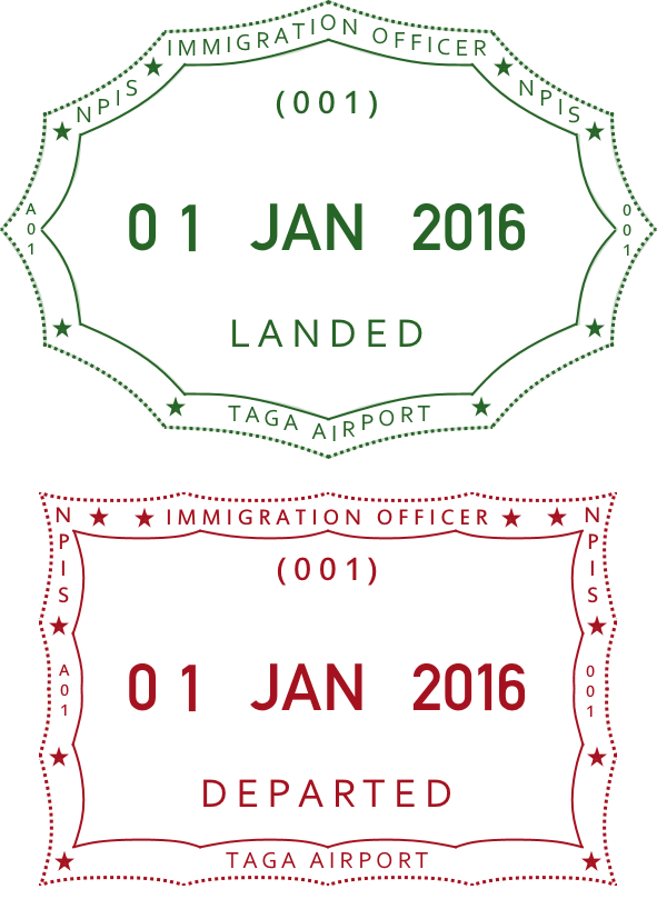
And why not also an image of them in "use", too:

I've found, in general, good passport stamps are
1.) Clear and unambiguous
2.) Descriptive
If they look distinctive too, that's a big plus.
Anyways, here are the designs of the new Pearl Islands stamps:
And why not also an image of them in "use", too:
Because I moved to a new institution, getting set up is taking a lot of time, especially when you need a specific chemical and it takes three weeks for it to arrive. Fun stuff. So I spent some time updating and upgrading one of my older projects, banknotes (and coins) for the Pearl Islands. However, the topic here are the banknotes.
First of all, the currency was one I imagined a bit to be like the old French franc and current Danish and Swedish crowns: about 7 or so to a dollar (well, that was the rate of the franc back when I travelled to France in the early 2000's), similar currency structure, and some of the banknote design elements taken from the Danish krone.
In thinking about redesigning, though, a question of practicality came up: these are islands, and transportation costs to and from said islands are really high; similar to the situation in Hawaii, most food needs to be imported, so the prices will correspondingly be pretty high. And that creates a bit of a need for higher-valued banknotes, especially if electronic payment penetration isn't very high (and sometimes even if it is... see the case of South Korea). Hence, a 500-shilling note got added.
Also, most countries use coins for denominations around $2 to $3 due to cost efficiency, meaning the 20-shilling note seems not very efficient. So that got replaced by a coin.
Anyways, without further ado...
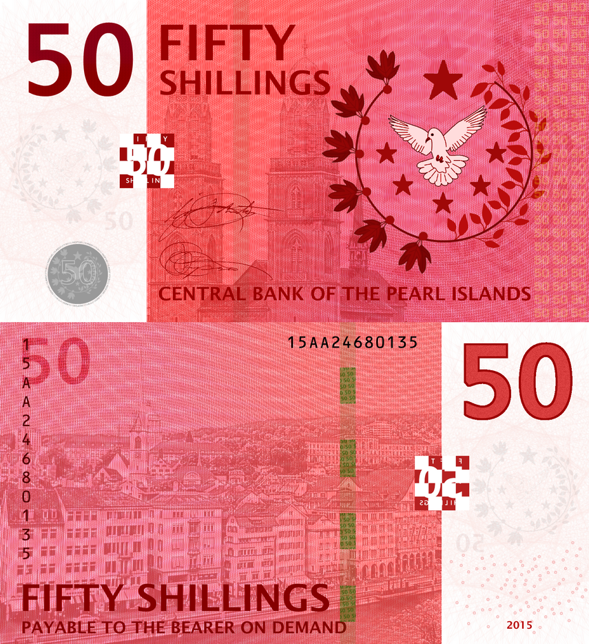
50 shillings (USD 7 / EUR 6.50 / GBP 4.50)
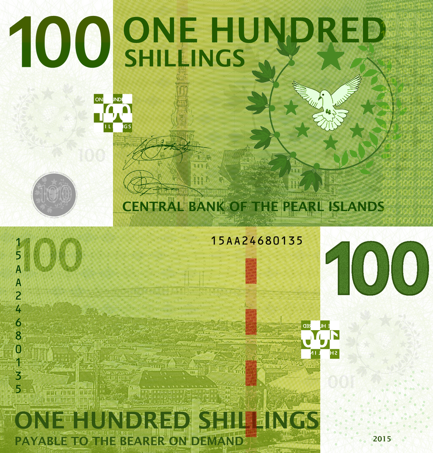
100 shillings
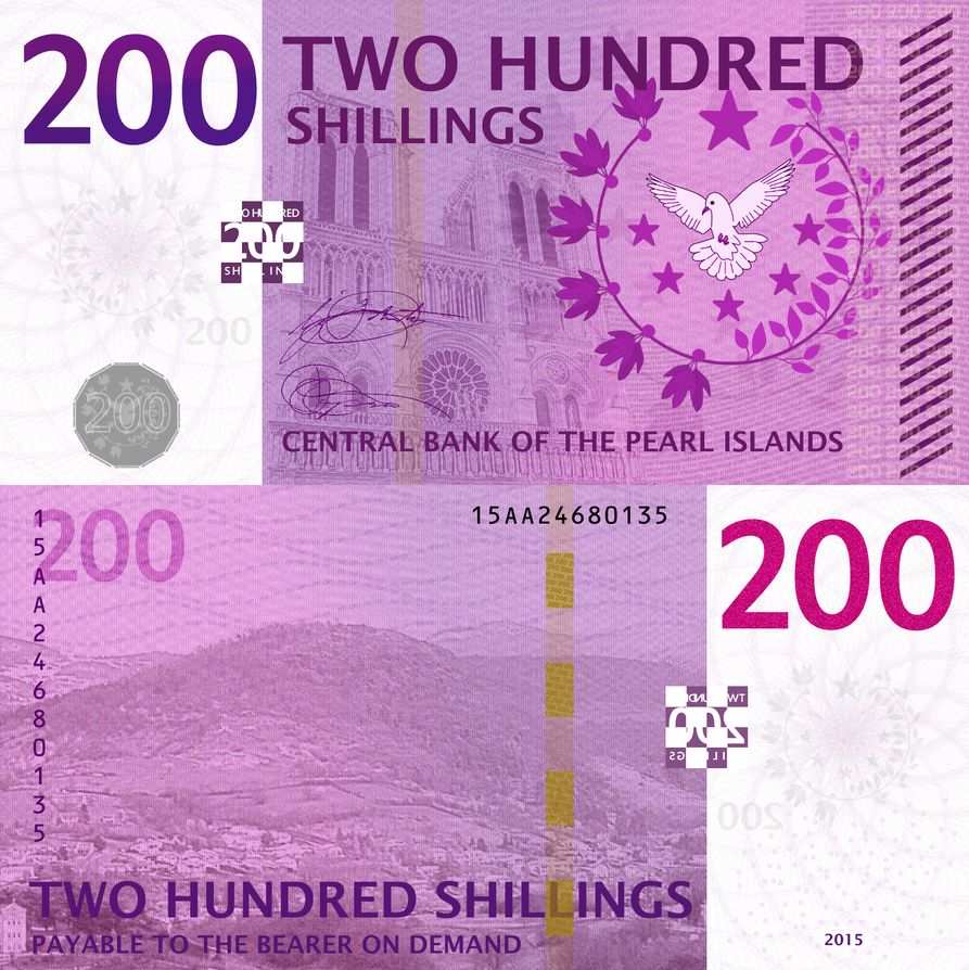
200 shillings
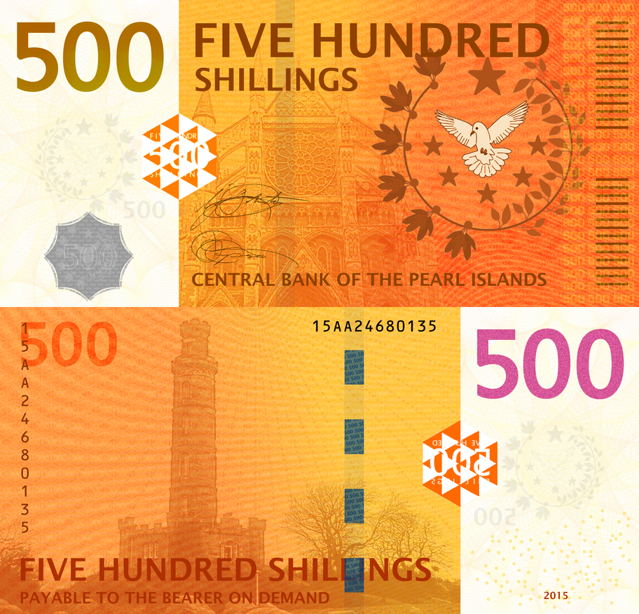
500 shillings
Most commonly used notes are actually the 100 and 200, as ATMs are most likely to dispense these. The 500's are becoming increasingly used, but are far from being common.
Also, coins. Because I like coins, too.
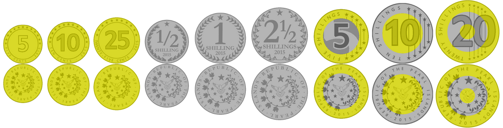
The 5- and 10-cent coins are rather rare and only are used at some supermarkets and gas stations; in practice, the 25-cent coin is the smallest used coin. The 20-shilling is slowly becoming more and more common due to the discontinuation of the 20-franc note, though the ½ shilling coin isn't particularly common due to most rounding tending to disfavor its use.
First of all, the currency was one I imagined a bit to be like the old French franc and current Danish and Swedish crowns: about 7 or so to a dollar (well, that was the rate of the franc back when I travelled to France in the early 2000's), similar currency structure, and some of the banknote design elements taken from the Danish krone.
In thinking about redesigning, though, a question of practicality came up: these are islands, and transportation costs to and from said islands are really high; similar to the situation in Hawaii, most food needs to be imported, so the prices will correspondingly be pretty high. And that creates a bit of a need for higher-valued banknotes, especially if electronic payment penetration isn't very high (and sometimes even if it is... see the case of South Korea). Hence, a 500-shilling note got added.
Also, most countries use coins for denominations around $2 to $3 due to cost efficiency, meaning the 20-shilling note seems not very efficient. So that got replaced by a coin.
Anyways, without further ado...
50 shillings (USD 7 / EUR 6.50 / GBP 4.50)
100 shillings
200 shillings
500 shillings
Most commonly used notes are actually the 100 and 200, as ATMs are most likely to dispense these. The 500's are becoming increasingly used, but are far from being common.
Also, coins. Because I like coins, too.
The 5- and 10-cent coins are rather rare and only are used at some supermarkets and gas stations; in practice, the 25-cent coin is the smallest used coin. The 20-shilling is slowly becoming more and more common due to the discontinuation of the 20-franc note, though the ½ shilling coin isn't particularly common due to most rounding tending to disfavor its use.
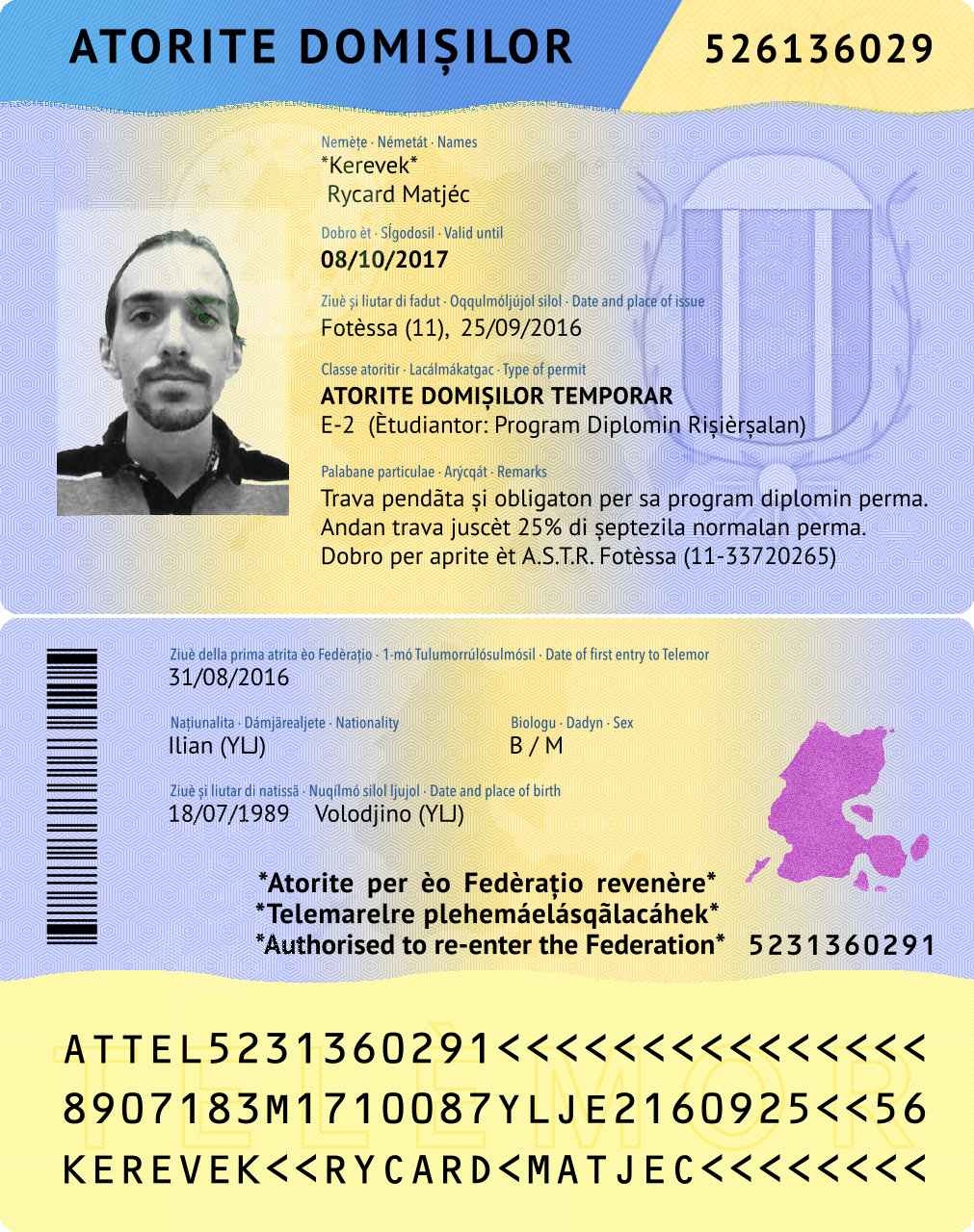
Depending on the country, ID cards are important. My concountries are no exception to this, with Ilia having a mandatory ID card policy.
However, there are two different ID cards: one for Ilians...
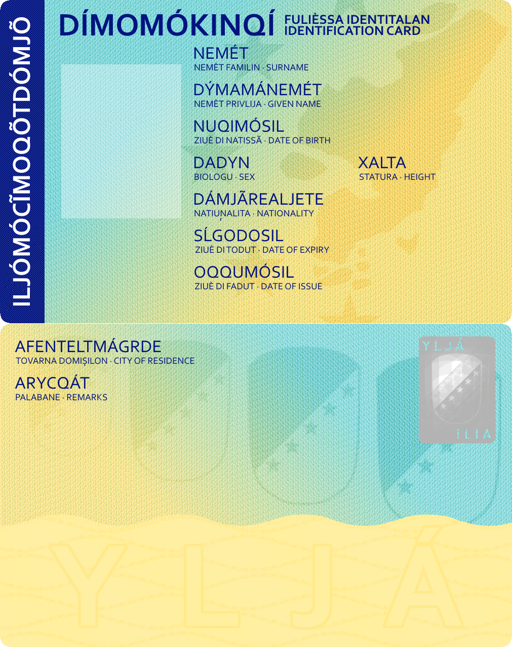
...and one for foreigners.
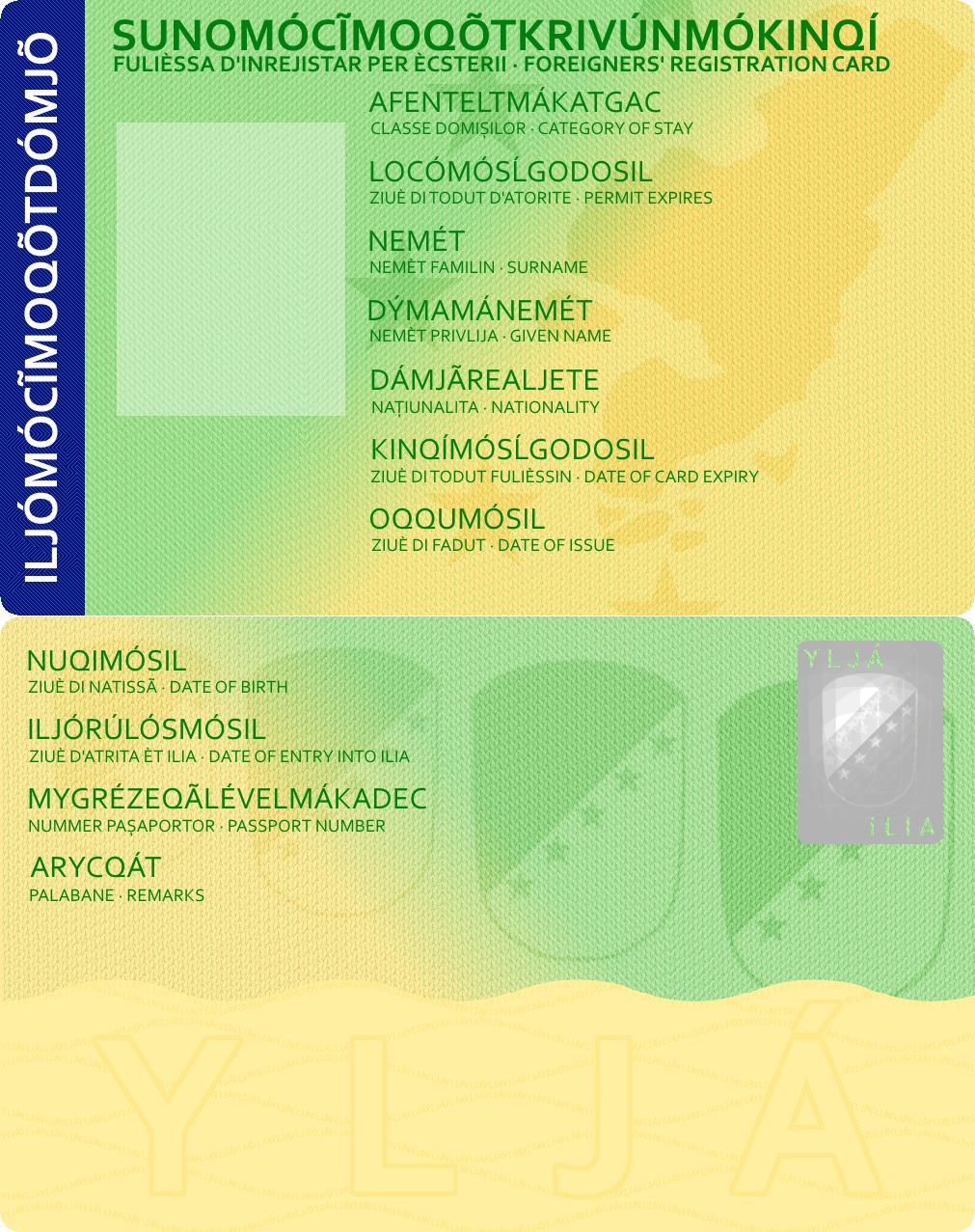
However, there are two different ID cards: one for Ilians...
...and one for foreigners.
I bored. So I made some money recently as part of my semi-continuous revamping of projects.

YJD 25 (~US$1)
YJD 100 (~US$4)
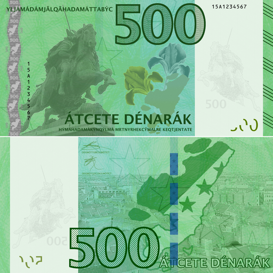
YJD 500 (~US$20)
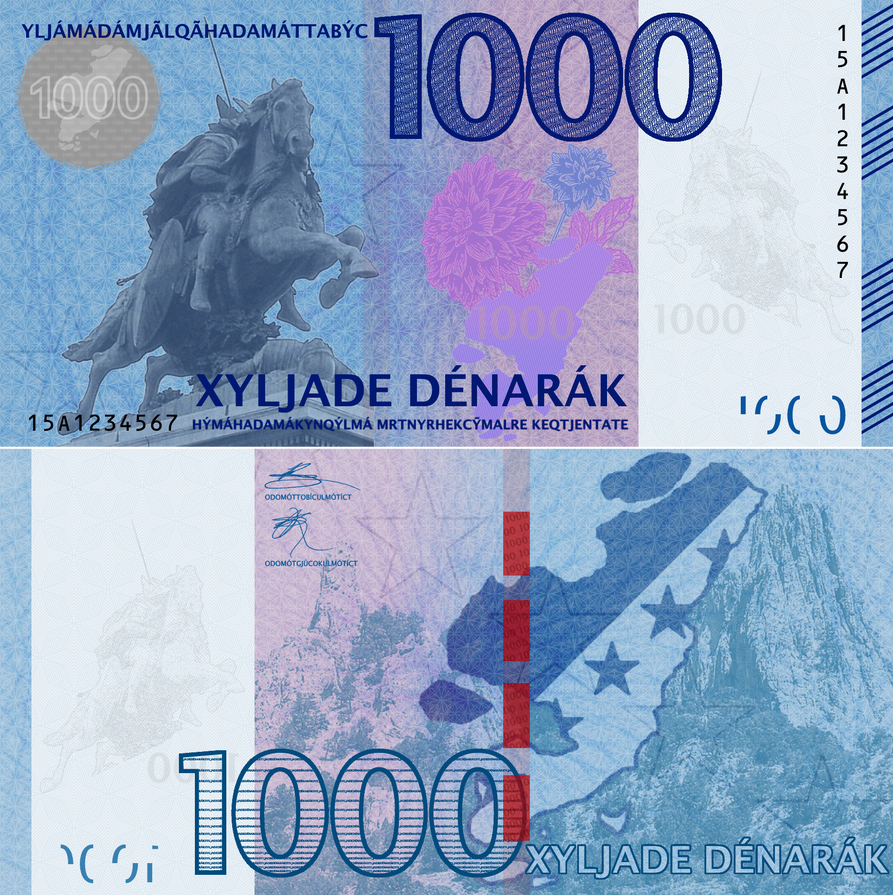
YJD 1000 (~US$40)
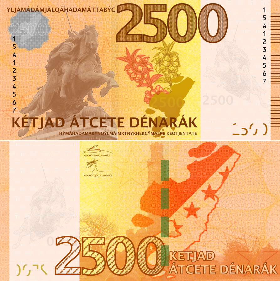
YJD 2500 (~US$100)
YJD 25 (~US$1)
YJD 100 (~US$4)
YJD 500 (~US$20)
YJD 1000 (~US$40)
YJD 2500 (~US$100)
So, after three nice, relaxing weeks in North Carolina, I'm back in the dark abyss known as Ohio. This is because there is Science to be done, and I'm the Scientist to do said Science. I think. But, regardless, while I was away, I was very busy with things.
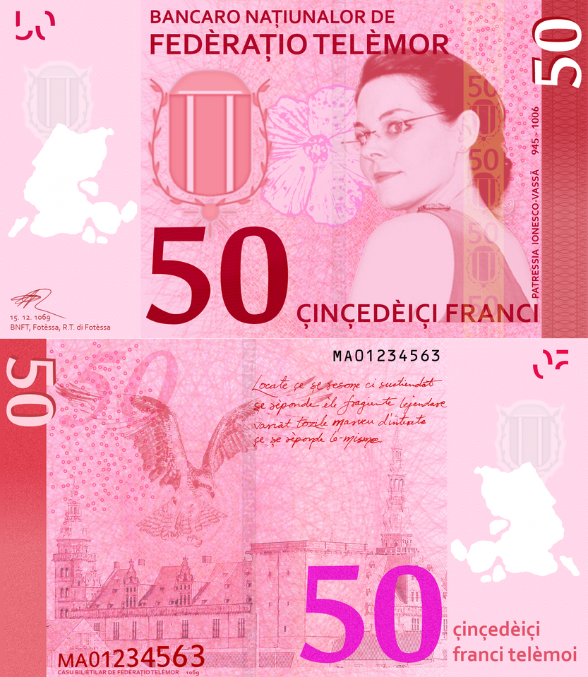
1.) Made a 50-franc note.
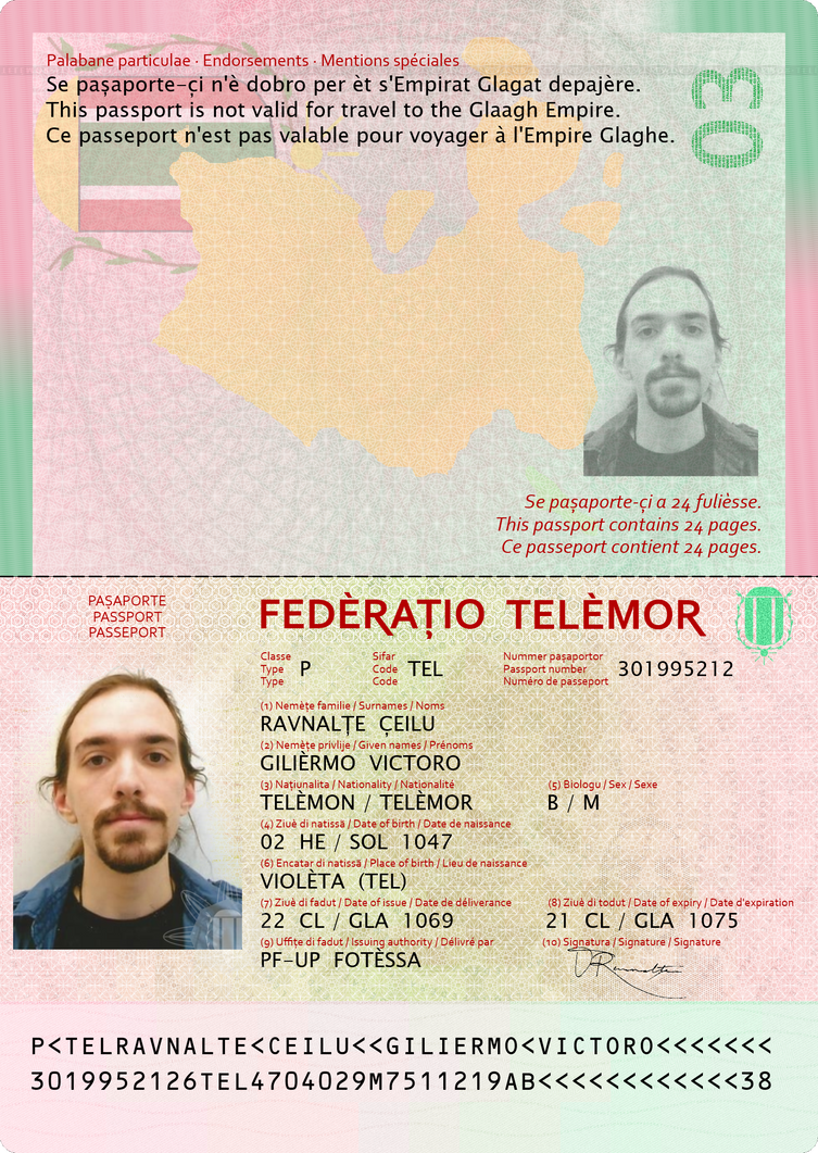
2.) Started a new passport design project, featuring higher resolution files and more stuff.
3.) Got a commission for a LOT of stuff to do. But should be fun. (More to come on that later.)
That's about it for now.
1.) Made a 50-franc note.
2.) Started a new passport design project, featuring higher resolution files and more stuff.
3.) Got a commission for a LOT of stuff to do. But should be fun. (More to come on that later.)
That's about it for now.