
Ever since I moved to Germany with my family in 1996, I've always been fascinated by money. Especially the fact that there was money that was so different from US currency (at the time, Germany used the Mark) and that every country had their own. A natural progression, thus, was first collecting it... but then designing my own.
I remember first coming up with my own designs that weren't meant to imitate another country's money when I was about eleven or so. Part of me wishes I still had some of my old paper banknotes to scan and show, but, alas, after my family moved back in 2010, I think they're languishing somewhere in the bottom of a box. On the other hand, though, I decided to move my efforts to the computer in about 2009 or so using a program called Paint.NET. First results were rather tragic, but I decided to keep at it and keep working.
The first design that I was "comfortable" with was partly thanks to a solicitation for pictures I made on another forum to which I belong.
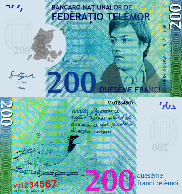
Problem with this one? For starters, I didn't have a scanner (or easy access to one), so the writing looks very clearly computer-like. Also, the resolution was only about 100 dpi, so the detail's a bit lacking. So, about two years later or so (around the time I left France, I think), I decided to clean it up and revise it: higher resolution, more detail, and the like as part of a revision project for all of my banknotes.
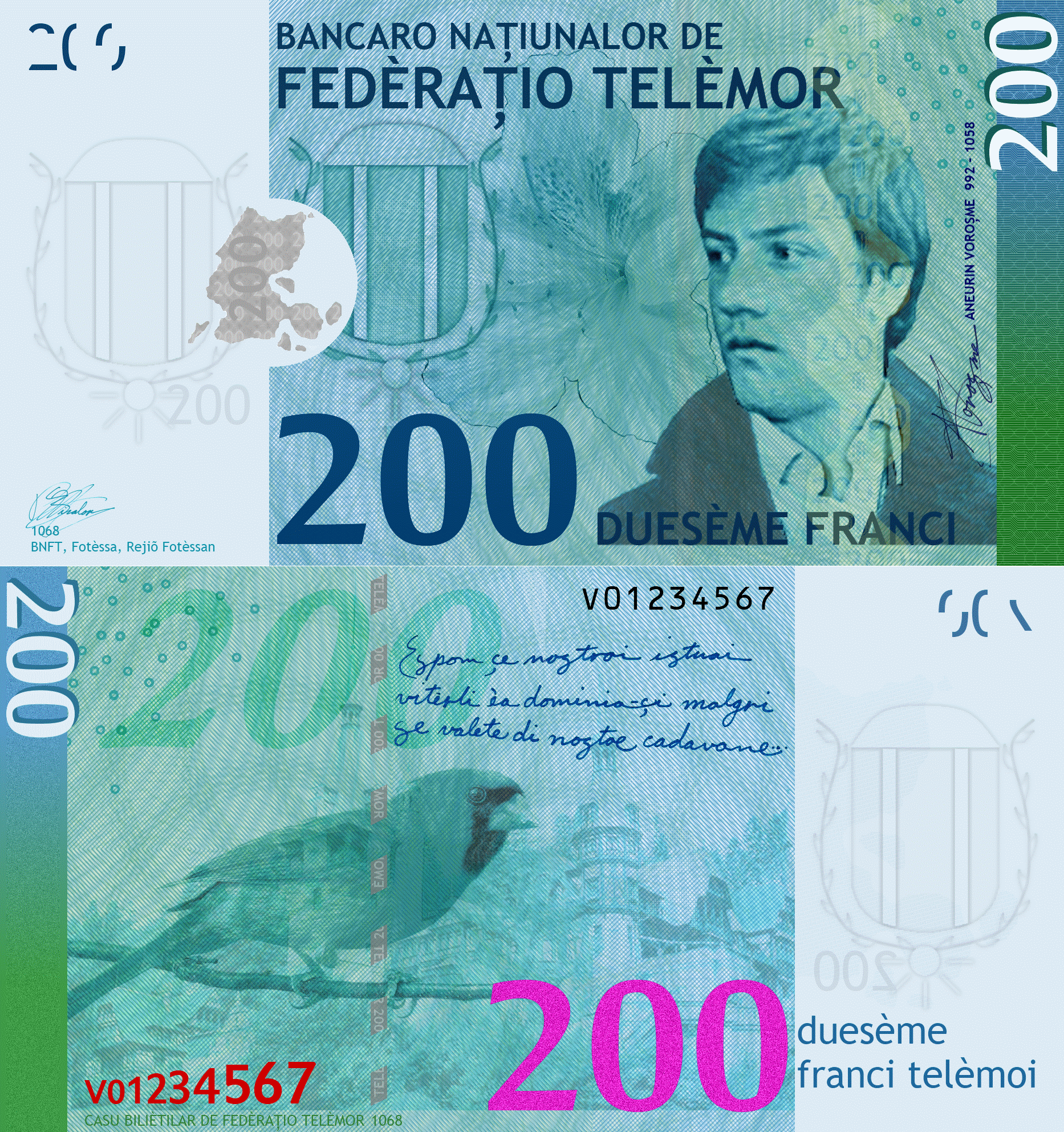
Looks better, at least in my view. But time progresses and I recently decided to revise it yet again, largely because I was revising the smaller notes. (More on that later.) Part of it was after seeing even more money, paying attention to the details on it, and coming up with some new ideas for how to render the images and work with things (plus some extra security stuff).
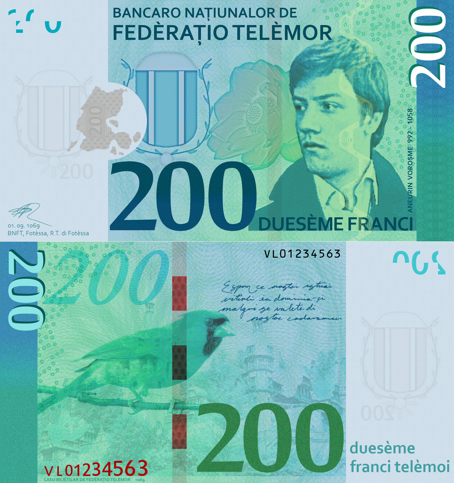
This works a lot better, at least in my view: for one, it's cleaner. I switched the font to Corbel because, to me, it looked a lot crisper and more appropriate for banknotes than the old font (Trebuchet) and it additionally could render some of the characters Telèmor has that Trebuchet doesn't possess (namely, the s- and t-comma). Also, in the interim, I got a bit better with underprint and patterns of that sort, so I figured their incorporation would only be positive.
Over the course of the next weeks, there may be more in this series, though I'm not sure what to cover or if a tutorial should come at some point. We'll see, though.
I remember first coming up with my own designs that weren't meant to imitate another country's money when I was about eleven or so. Part of me wishes I still had some of my old paper banknotes to scan and show, but, alas, after my family moved back in 2010, I think they're languishing somewhere in the bottom of a box. On the other hand, though, I decided to move my efforts to the computer in about 2009 or so using a program called Paint.NET. First results were rather tragic, but I decided to keep at it and keep working.
The first design that I was "comfortable" with was partly thanks to a solicitation for pictures I made on another forum to which I belong.
Problem with this one? For starters, I didn't have a scanner (or easy access to one), so the writing looks very clearly computer-like. Also, the resolution was only about 100 dpi, so the detail's a bit lacking. So, about two years later or so (around the time I left France, I think), I decided to clean it up and revise it: higher resolution, more detail, and the like as part of a revision project for all of my banknotes.
Looks better, at least in my view. But time progresses and I recently decided to revise it yet again, largely because I was revising the smaller notes. (More on that later.) Part of it was after seeing even more money, paying attention to the details on it, and coming up with some new ideas for how to render the images and work with things (plus some extra security stuff).
This works a lot better, at least in my view: for one, it's cleaner. I switched the font to Corbel because, to me, it looked a lot crisper and more appropriate for banknotes than the old font (Trebuchet) and it additionally could render some of the characters Telèmor has that Trebuchet doesn't possess (namely, the s- and t-comma). Also, in the interim, I got a bit better with underprint and patterns of that sort, so I figured their incorporation would only be positive.
Over the course of the next weeks, there may be more in this series, though I'm not sure what to cover or if a tutorial should come at some point. We'll see, though.
Comments
9 years ago

Your graphix sk1llz are amaze.
9 years ago

The handwritten part also looks more convincing on the latest version. I don't think you'd see a font like Trebuchet on banknotes. It has to be something more dignified and serious  I like Corbel better.
I like Corbel better.
9 years ago

I've always been amazed at the beautiful banknotes you're producing!