With the Year of the Dragon almost upon us, some commemorative things seemed to be in order. Telemor and Ilia don't celebrate the Lunar New Year to a great deal, so coins didn't seem appropriate, but some stamps were instead on the menu.

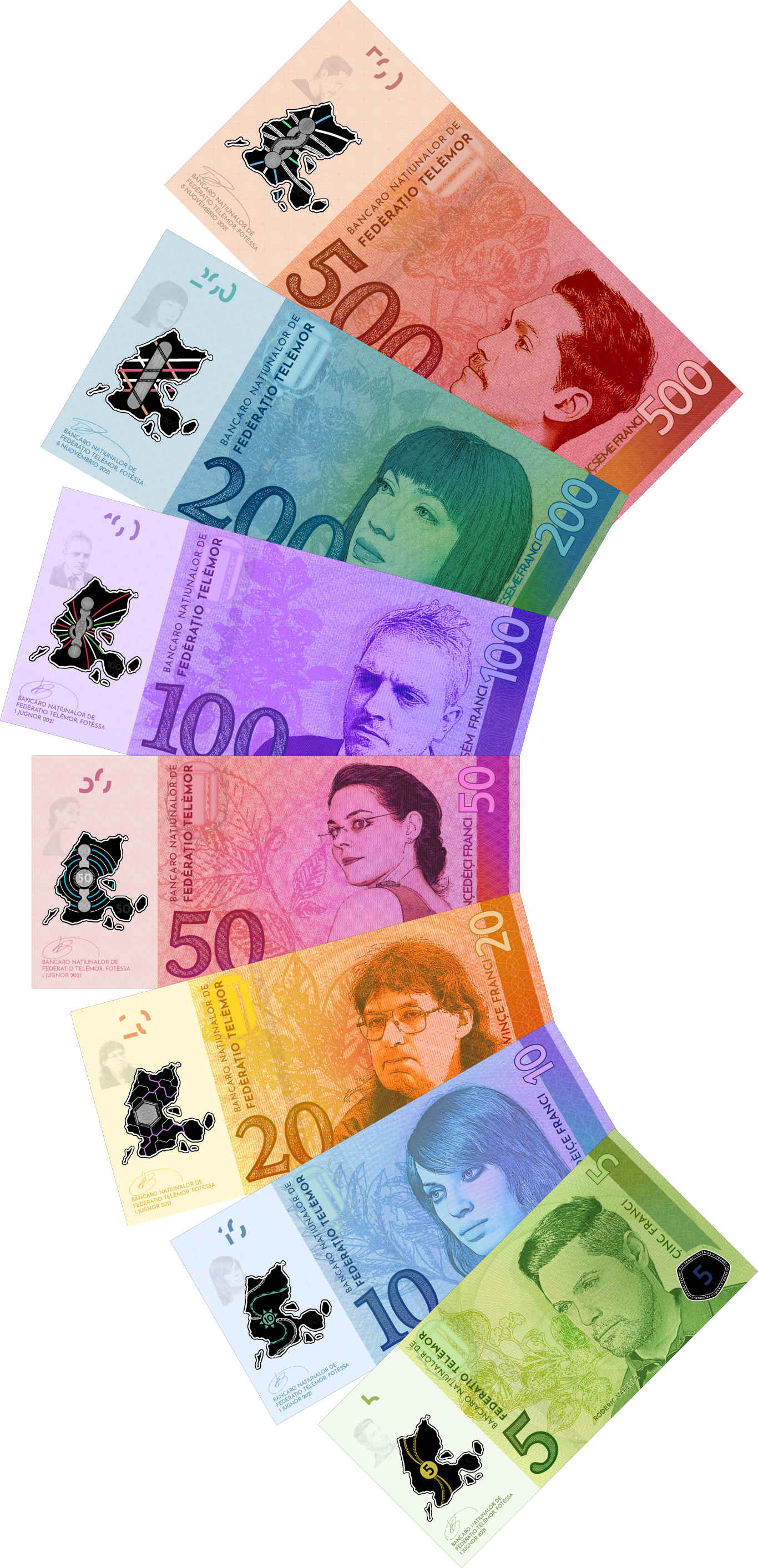
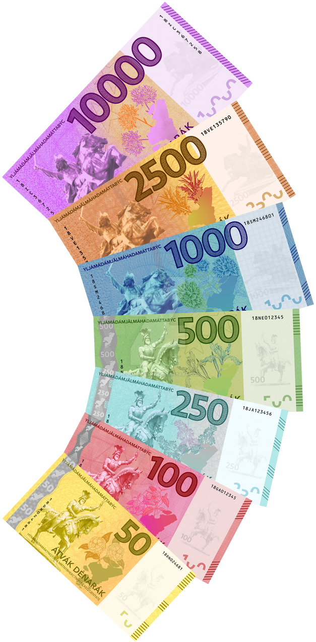
Over the course of the past eight(!) or so months, I've undertaken a somewhat slow banknote revitalization project to redo the Telèmor banknotes (which needed quite a bit of updating). I can, however, now finally share that the new series is complete:
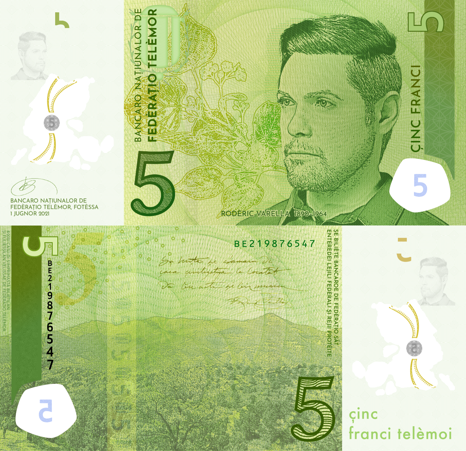
After a long while of not doing it, I decided to get back into some banknote design, starting with an old currency and some very old banknotes that needed refreshing. Therefore, behold: the redesigned Telèmor 5 franc note.
When I was almost six, my family moved to Germany. This was back in the days of the Deutsche Mark, so imagine going from the (then) monochrome and boring US banknotes to these bright, colorful German banknotes with different people on them, unique designs, and, as I later found out, a celebration of German artists and scientists. And about a year later, we took our first trip to Italy, with yet two more different currencies (Austrian Schillings and Italian lire), which was even more fascinating. So, ever since then, I've been a banknote collector, but more interestingly (to me) is that I like to design my own banknotes for fictional currencies.
So, what goes on a banknote? Banknotes, in a way, are a country's calling card: by looking at them, you can learn something about a country's culture, what and who the country finds important, and the like. And almost anyone visiting a different country will likely encounter a different currency, so the currency should (to me) make a good impression.
There are two aspects of the design: what and how.
Let's first start with a real-life example of a banknote.

This is the old French 500 franc note (~€76). When you look at it, apart from the color scheme, there are two people who are quite prominent: these are the Curies (Marie and Pierre), pioneers in radiation research. You can see some assorted radioactivity-related motifs on the front as well.
Now let's have a look at the back:

The back is a science laboratory, in particular (probably) the Curies' laboratory. It's related to the front (though this always isn't the case), but all of the French banknotes have some sort of theme between the front and back to tie them together. (This is also the approach of the Deutsche Mark notes, the 8th series Swiss notes, some of the Korean won banknotes, and the like.) Other countries have a bit of a disjoint, where there's not really a relation between front and back, but the two sides are both culturally-relevant (e.g. Polish złoty, Swedish krona, Japanese yen...).
Picking people for banknotes can be controversial, however. Argentina recently removed all the people from their notes in favor of animals and there's been ongoing controversy in the US over changing the designs of the dollar notes. That said, it's said that using people is a bit "safer", since the public is more acutely aware if something's wrong with a face that they know than with a generic building, animal, or scene. (Also possibly why China went from using 'unknown' people on their notes to Mao Zedong on all the renminbi notes since around 2000.) Often, if there's one person on all notes, it'll be a founder, liberator, or important person to that country (e.g. Bangladesh, Pakistan, and India all use a single person for each of their notes; Sheikh Mujibur Rahman, Muhammad Ali Jinnah, and Mahatma Gandhi, respectively) or a monarch (e.g. Queen Elizabeth II on all Bank of England notes). Living people are rare unless they're a monarch or have an otherwise inflated ego.
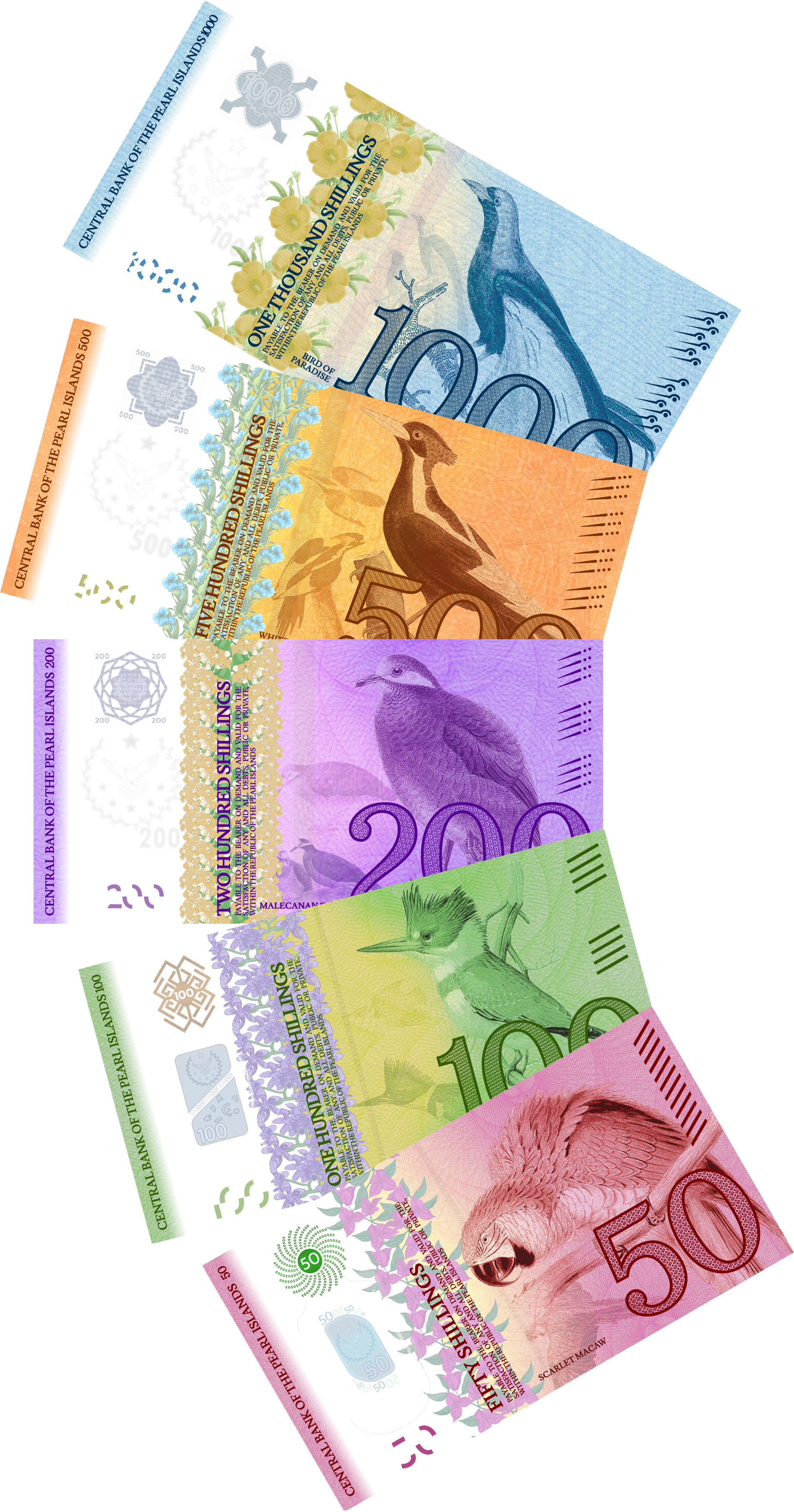
One of the most recently-completed banknote series I've done is for the Ilian dénar. Ilia's a country with a bit of an unusual history, and the recent history is very turbulent. Therefore, the main motifs are less-controversial kings and rulers from the past who united the country or otherwise ruled with minimal controversy and bloodshed.
Here are the obverses of the Ilian banknotes:
As you can see, there are two separate people on the fronts: these are two of the first Ilian kings. (Originally, they all featured the same person on the front.) These were chosen to be largely noncontroversial (the first Ilian kings are largely noncontroversial, especially compared to recent history), much like how Polish banknotes use old Polish kings on their obverses to commemorate Polish pre-Partition history.
Because my actual drawing skills are quite lacking, I repurpose photos from my trips, from gracious donations, and the public domain into depicting scenery/places/people relevant to the concountry. Fortunately, Ilia has enough diverse scenery/landscapes where I can kinda justify choices.
Let's delve a bit more into one of the banknotes, namely the ten thousand (because OMG MONEY):
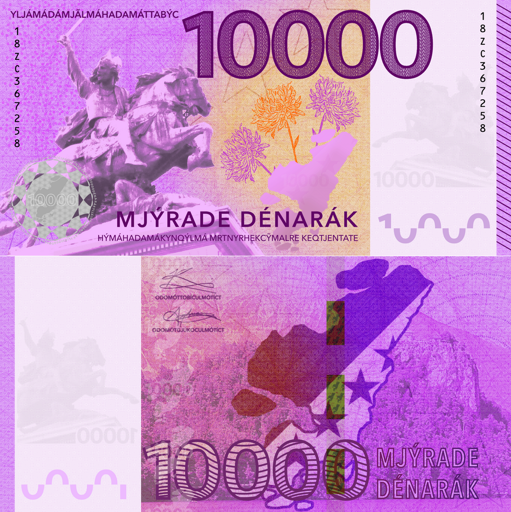
The obverse (at top) features an image of Pocóg, the first king of a united Ilia who is considered the "founder" of the single united Ilian nation, while the reverse shows a view of a mountainside lake not far from the Telemor-Ilian border. Each Ilian banknote features a different scene on the reverse, either architectural or natural, the idea being to showcase Ilian beauty. At the same time, complex images, like scenes such as that, are difficult to counterfeit well, especially if it's something that's recognizable readily.
A recurring motif in all the notes, though, is from the Ilian coat of arms and the five stars (arranged in a diagonal). Having the coat of arms of the issuing country (or seal... or emblem otherwise) is standard practice in many countries and helps with identification. The French example doesn't have one (but, then again, France does not have an official coat of arms), but many notes do (ex. Euro notes and the European flag, English notes and the Bank of England seal...).
When designing notes, color is another important thing: what colors do I want to feature? Think about literacy (if your conpeople are less literate, then having similarly-colored baknotes may not be a good thing, like a tale in Pakistan about people confusing 20-rupee notes for 5000 notes, or in Korea between the 5000 and the 50000 won notes), about whether or not banknotes are the same (or close to the same) physical size...
Notes can be multicolored, and often are (to improve, again, security), but normally there's a single overarching color scheme for a given banknote and colors are somewhat complementary to each other. Remember that, especially if illiteracy is an issue, that there should also be an easy way to distinguish between different values.
Physical size is also key, and it's one of the easiest ways to distinguish denominations from each other. Countries can often fall under four categories:
This can be challenging to do. Here's what I recommend:
1.) Do I want people, places, or things? What would my conpeople/conculture value? What are good symbols or representatives of the concountry? (Do they value arts, science, culture... or are they more proud about their glorious history?)
2.) Would having a given person or motif on a banknote be controversial to them? Some choices of people have caused debates, especially given some of the history behind them (eg. Birgit Nilsson on the most recent Swedish 500-kronor note). At the same time, however, people can be one of the "safest" things to include, because it's easier to notice if something's off about a person as opposed to, for example, a flower or an animal (and thus is an extra layer of protection).
3.) What are some national symbols? Having coats of arms, silhouettes of maps, and the like can be good design elements, especially to reinforce the banknote being from a given location/nation.
4.) What goes well with the color scheme you've picked? If you're including plants that are exceptionally multicolored, can you capture the coloration well (if you want to)?
Another good technique is, if you use people, to have everything related to the subject: for example, let's take the German 100 mark note:

The pianist on the front is Clara Schumann, but the other motifs are related to her (somehow): the lyre represents that she was an accomplished musician, and the buildings in the background are from Leipzig, where she grew up. Having things linked provides more of a theme and tells a story about the person, which can be quite catching (and informative/instructive).
When in doubt, simpler is better. I recommend not cluttering the front or reverse with too much: the numbers and values should be clear and distinctive, and having too much clutter makes it harder to distinguish the features (and being able to identify by eye is a way to check for counterfeits!). Having one main motif on each side, potentially with a detailed and intricate background, works best, though sometimes not having a main motif on the reverse can be effective (see: 8th series Swiss franc and the last series of Dutch guilder banknotes)
Finally, make room for security features. Watermarks often incorporate the main motif, as do (sometimes) holographic features. If you're using a polymer banknote template, similarly, the transparent windows and holographic/foil features with the windows will incorporate or relate to the main motif. In my case for Ilian banknotes, the watermark incorporates the portrait of the given person (along with the value).
So, what goes on a banknote? Banknotes, in a way, are a country's calling card: by looking at them, you can learn something about a country's culture, what and who the country finds important, and the like. And almost anyone visiting a different country will likely encounter a different currency, so the currency should (to me) make a good impression.
There are two aspects of the design: what and how.
- What should go on the banknote? (e.g. which people, animals, plants, scenery...)
- How should everything be arranged, and how can security features be integrated to make a safe product?
Picking Your Motifs
Let's first start with a real-life example of a banknote.
This is the old French 500 franc note (~€76). When you look at it, apart from the color scheme, there are two people who are quite prominent: these are the Curies (Marie and Pierre), pioneers in radiation research. You can see some assorted radioactivity-related motifs on the front as well.
Now let's have a look at the back:
The back is a science laboratory, in particular (probably) the Curies' laboratory. It's related to the front (though this always isn't the case), but all of the French banknotes have some sort of theme between the front and back to tie them together. (This is also the approach of the Deutsche Mark notes, the 8th series Swiss notes, some of the Korean won banknotes, and the like.) Other countries have a bit of a disjoint, where there's not really a relation between front and back, but the two sides are both culturally-relevant (e.g. Polish złoty, Swedish krona, Japanese yen...).
Picking people for banknotes can be controversial, however. Argentina recently removed all the people from their notes in favor of animals and there's been ongoing controversy in the US over changing the designs of the dollar notes. That said, it's said that using people is a bit "safer", since the public is more acutely aware if something's wrong with a face that they know than with a generic building, animal, or scene. (Also possibly why China went from using 'unknown' people on their notes to Mao Zedong on all the renminbi notes since around 2000.) Often, if there's one person on all notes, it'll be a founder, liberator, or important person to that country (e.g. Bangladesh, Pakistan, and India all use a single person for each of their notes; Sheikh Mujibur Rahman, Muhammad Ali Jinnah, and Mahatma Gandhi, respectively) or a monarch (e.g. Queen Elizabeth II on all Bank of England notes). Living people are rare unless they're a monarch or have an otherwise inflated ego.
Ilian Dénar: History and Landscapes
One of the most recently-completed banknote series I've done is for the Ilian dénar. Ilia's a country with a bit of an unusual history, and the recent history is very turbulent. Therefore, the main motifs are less-controversial kings and rulers from the past who united the country or otherwise ruled with minimal controversy and bloodshed.
Here are the obverses of the Ilian banknotes:
As you can see, there are two separate people on the fronts: these are two of the first Ilian kings. (Originally, they all featured the same person on the front.) These were chosen to be largely noncontroversial (the first Ilian kings are largely noncontroversial, especially compared to recent history), much like how Polish banknotes use old Polish kings on their obverses to commemorate Polish pre-Partition history.
Because my actual drawing skills are quite lacking, I repurpose photos from my trips, from gracious donations, and the public domain into depicting scenery/places/people relevant to the concountry. Fortunately, Ilia has enough diverse scenery/landscapes where I can kinda justify choices.
Let's delve a bit more into one of the banknotes, namely the ten thousand (because OMG MONEY):
The obverse (at top) features an image of Pocóg, the first king of a united Ilia who is considered the "founder" of the single united Ilian nation, while the reverse shows a view of a mountainside lake not far from the Telemor-Ilian border. Each Ilian banknote features a different scene on the reverse, either architectural or natural, the idea being to showcase Ilian beauty. At the same time, complex images, like scenes such as that, are difficult to counterfeit well, especially if it's something that's recognizable readily.
A recurring motif in all the notes, though, is from the Ilian coat of arms and the five stars (arranged in a diagonal). Having the coat of arms of the issuing country (or seal... or emblem otherwise) is standard practice in many countries and helps with identification. The French example doesn't have one (but, then again, France does not have an official coat of arms), but many notes do (ex. Euro notes and the European flag, English notes and the Bank of England seal...).
Pretty Colors and Sizes
When designing notes, color is another important thing: what colors do I want to feature? Think about literacy (if your conpeople are less literate, then having similarly-colored baknotes may not be a good thing, like a tale in Pakistan about people confusing 20-rupee notes for 5000 notes, or in Korea between the 5000 and the 50000 won notes), about whether or not banknotes are the same (or close to the same) physical size...
Notes can be multicolored, and often are (to improve, again, security), but normally there's a single overarching color scheme for a given banknote and colors are somewhat complementary to each other. Remember that, especially if illiteracy is an issue, that there should also be an easy way to distinguish between different values.
Physical size is also key, and it's one of the easiest ways to distinguish denominations from each other. Countries can often fall under four categories:
- All/most banknotes are the same size. (Main examples are the Hungarian forint, Canadian dollar, and US dollar notes, while Russian ruble notes use "slabs" of certain denominations: the 10 through 500 ruble notes are the same size, while the 1000 ruble and up notes are the same, larger size.)
- There's one dimension, usually width, that's constant, while the other dimension (length) varies by a fixed amount between denominations. (Danish krone, Swiss Franc, Korean won, Dutch guilder, French franc, and Japanese yen banknotes are examples.)
- Banknotes will vary by a fixed difference in length and width between denominations. (ex. German mark, Pound sterling, Euro, and New Zealand dollar notes)
- A constant aspect ratio between length and width is maintained. (This is not as common, but a good example is the second-to-last series of Austrian Schilling notes.)
Picking your Motifs
This can be challenging to do. Here's what I recommend:
1.) Do I want people, places, or things? What would my conpeople/conculture value? What are good symbols or representatives of the concountry? (Do they value arts, science, culture... or are they more proud about their glorious history?)
2.) Would having a given person or motif on a banknote be controversial to them? Some choices of people have caused debates, especially given some of the history behind them (eg. Birgit Nilsson on the most recent Swedish 500-kronor note). At the same time, however, people can be one of the "safest" things to include, because it's easier to notice if something's off about a person as opposed to, for example, a flower or an animal (and thus is an extra layer of protection).
3.) What are some national symbols? Having coats of arms, silhouettes of maps, and the like can be good design elements, especially to reinforce the banknote being from a given location/nation.
4.) What goes well with the color scheme you've picked? If you're including plants that are exceptionally multicolored, can you capture the coloration well (if you want to)?
Another good technique is, if you use people, to have everything related to the subject: for example, let's take the German 100 mark note:
The pianist on the front is Clara Schumann, but the other motifs are related to her (somehow): the lyre represents that she was an accomplished musician, and the buildings in the background are from Leipzig, where she grew up. Having things linked provides more of a theme and tells a story about the person, which can be quite catching (and informative/instructive).
When in doubt, simpler is better. I recommend not cluttering the front or reverse with too much: the numbers and values should be clear and distinctive, and having too much clutter makes it harder to distinguish the features (and being able to identify by eye is a way to check for counterfeits!). Having one main motif on each side, potentially with a detailed and intricate background, works best, though sometimes not having a main motif on the reverse can be effective (see: 8th series Swiss franc and the last series of Dutch guilder banknotes)
Finally, make room for security features. Watermarks often incorporate the main motif, as do (sometimes) holographic features. If you're using a polymer banknote template, similarly, the transparent windows and holographic/foil features with the windows will incorporate or relate to the main motif. In my case for Ilian banknotes, the watermark incorporates the portrait of the given person (along with the value).
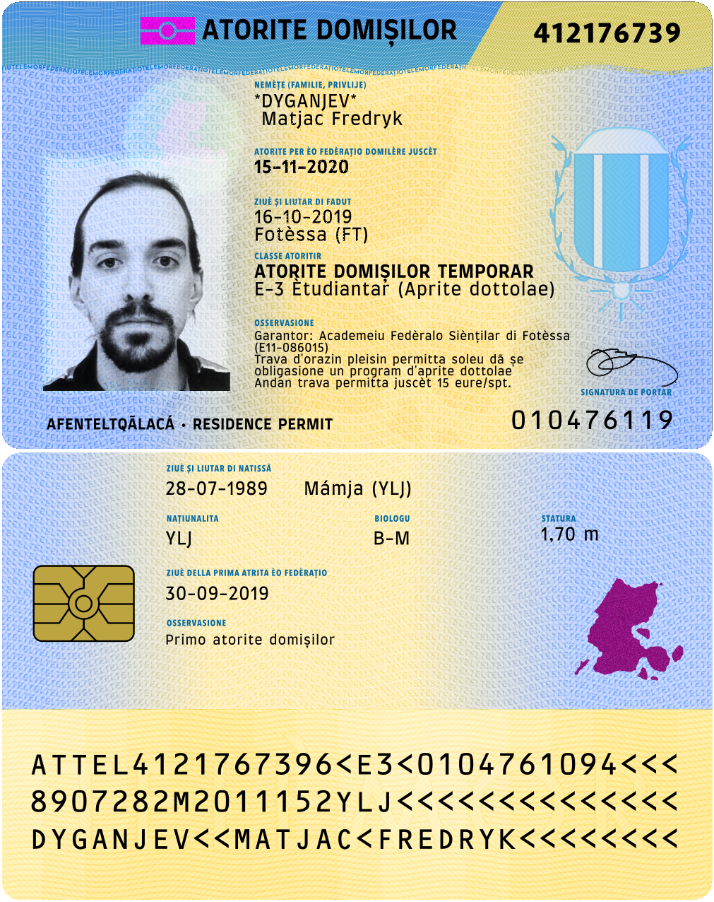
More general boredom and stuff means more reworking of things. And stuff. Like redesigning the Telemor residence permit card:
Fiddling with some stuff while procrastinating on writing my thesis, this time an Ilian driver's license. Happy with how it turned out.

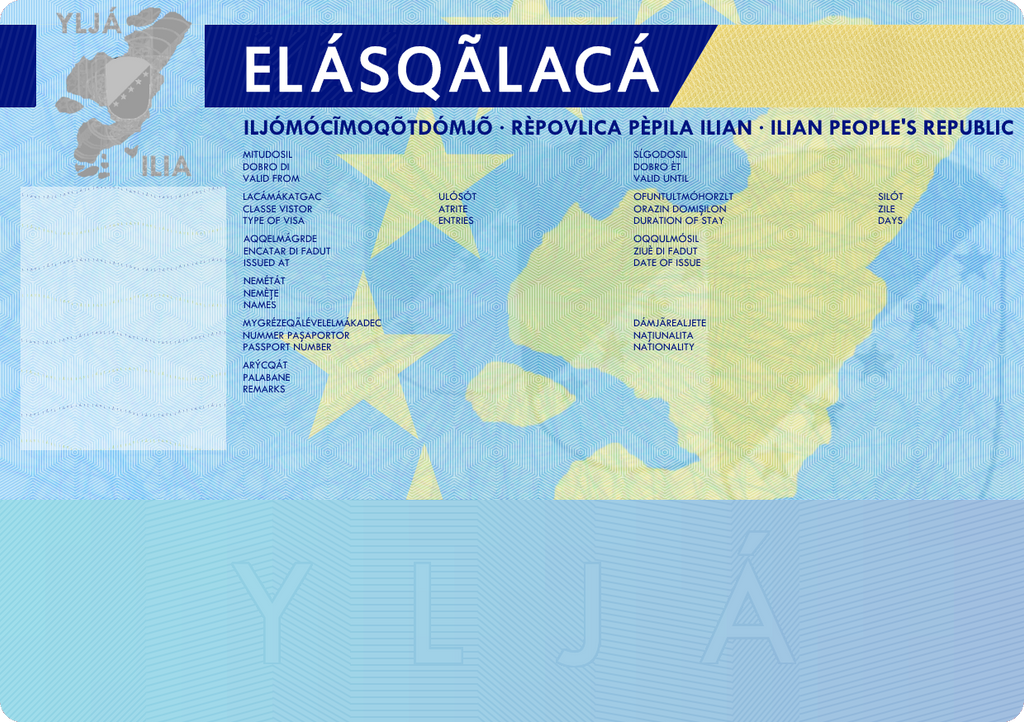
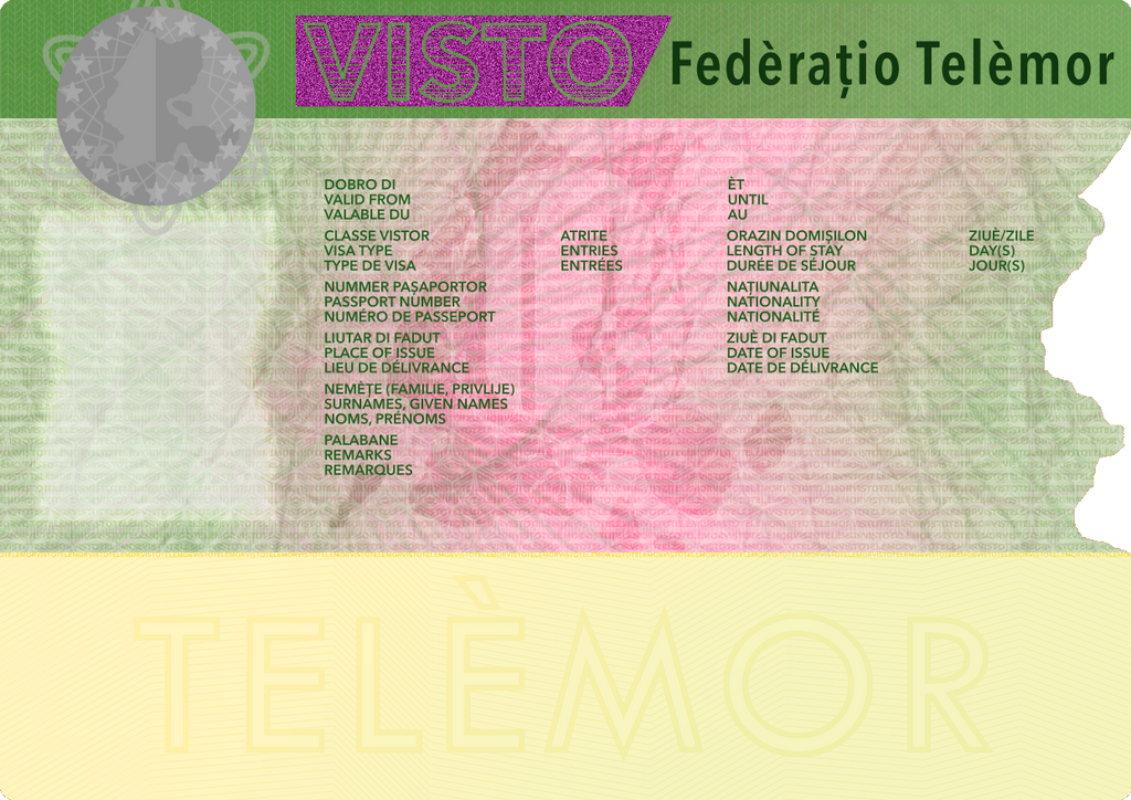
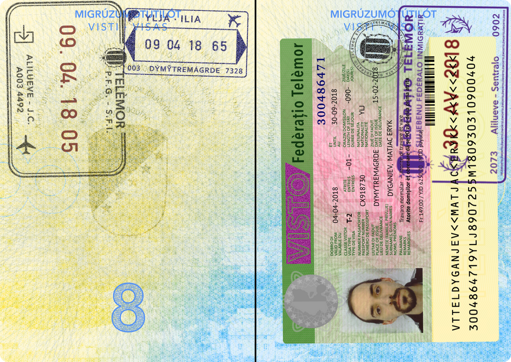
In continuing my revisiting of old projects, I decided to re-do the design for the Telemor entry visa.
And, because reasons, how about a pic of it in action, along with some stamps:
And, because reasons, how about a pic of it in action, along with some stamps:
Due to a confluence of various things, I decided to start revisiting some old art projects. And by art, well, I mean banknotes. Hence, here's some preliminary output for redesigning Telemor banknotes:
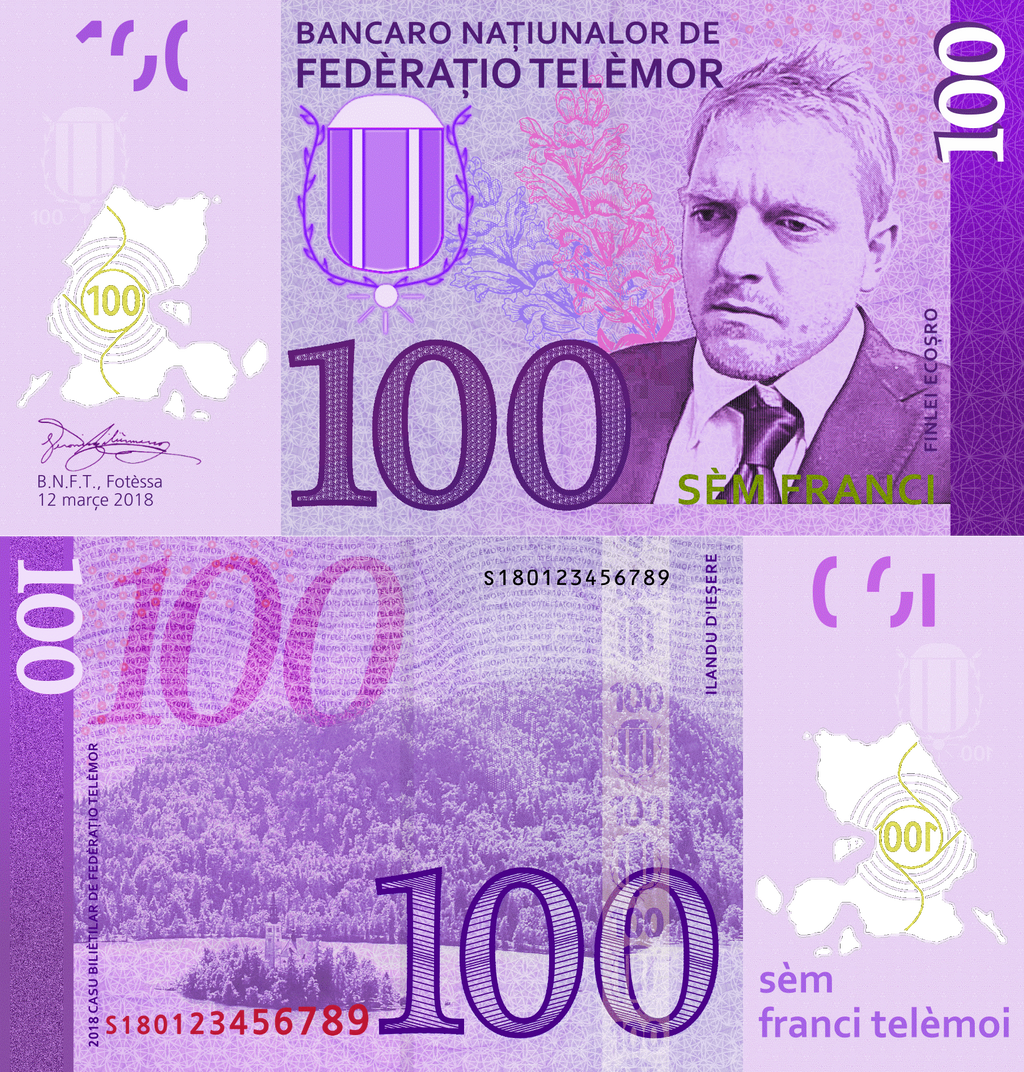
The big change here is I decided to have all the notes be polymer. Having a mix of paper and polymer is a bit strange, and I only know of Singapore, México, and the UK where this is the case. Plus, polymer tends to be more durable and counterfeit-resistant overall, so it seemed like a good choice (and logical one the Telemor government would take).
This also gives me practice with playing with polymer notes, and I'm more than happy to experiment and see what works in that regard. (Because reasons.)